The Cheese Maker
Brand identity and packaging for a leading regional producer of artisanal Italian cheeses.
The Cheese Maker is a Bahrain-based producer of premium Italian fresh cheeses, supplying supermarkets and hospitality businesses across the GCC. As the company looked to strengthen its presence in regional markets, Limefish was brought in to refresh its identity, packaging, and product imagery, creating a brand that better reflects the quality and craftsmanship behind its products.
The Maker Behind the Cheese
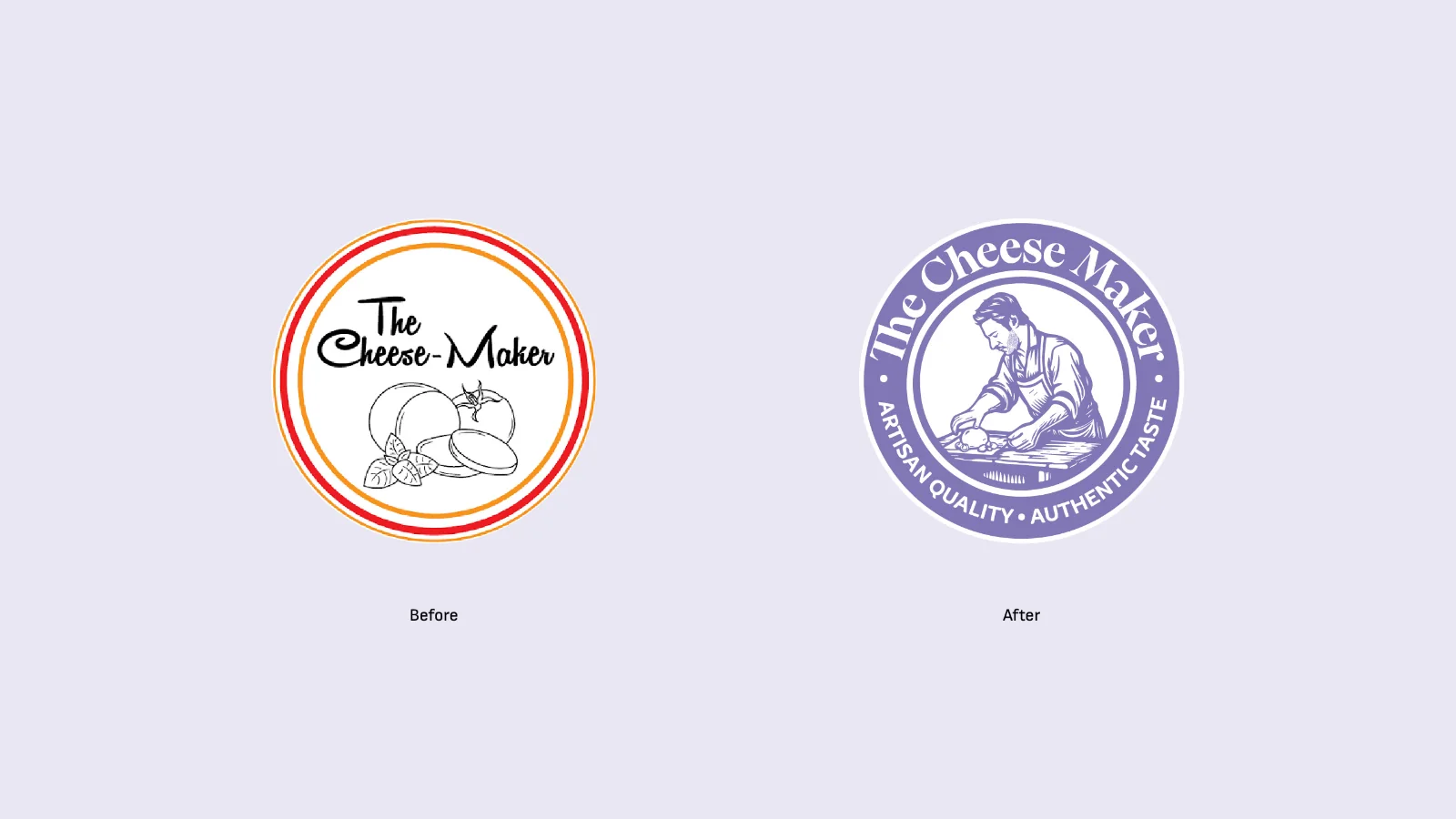
The Cheese Maker had built its reputation around the quality of its products, but its existing identity did little to communicate the craftsmanship and personality behind them. The logo lacked legibility and character, creating a disconnect between the brand's appearance and the premium cheeses it produced.
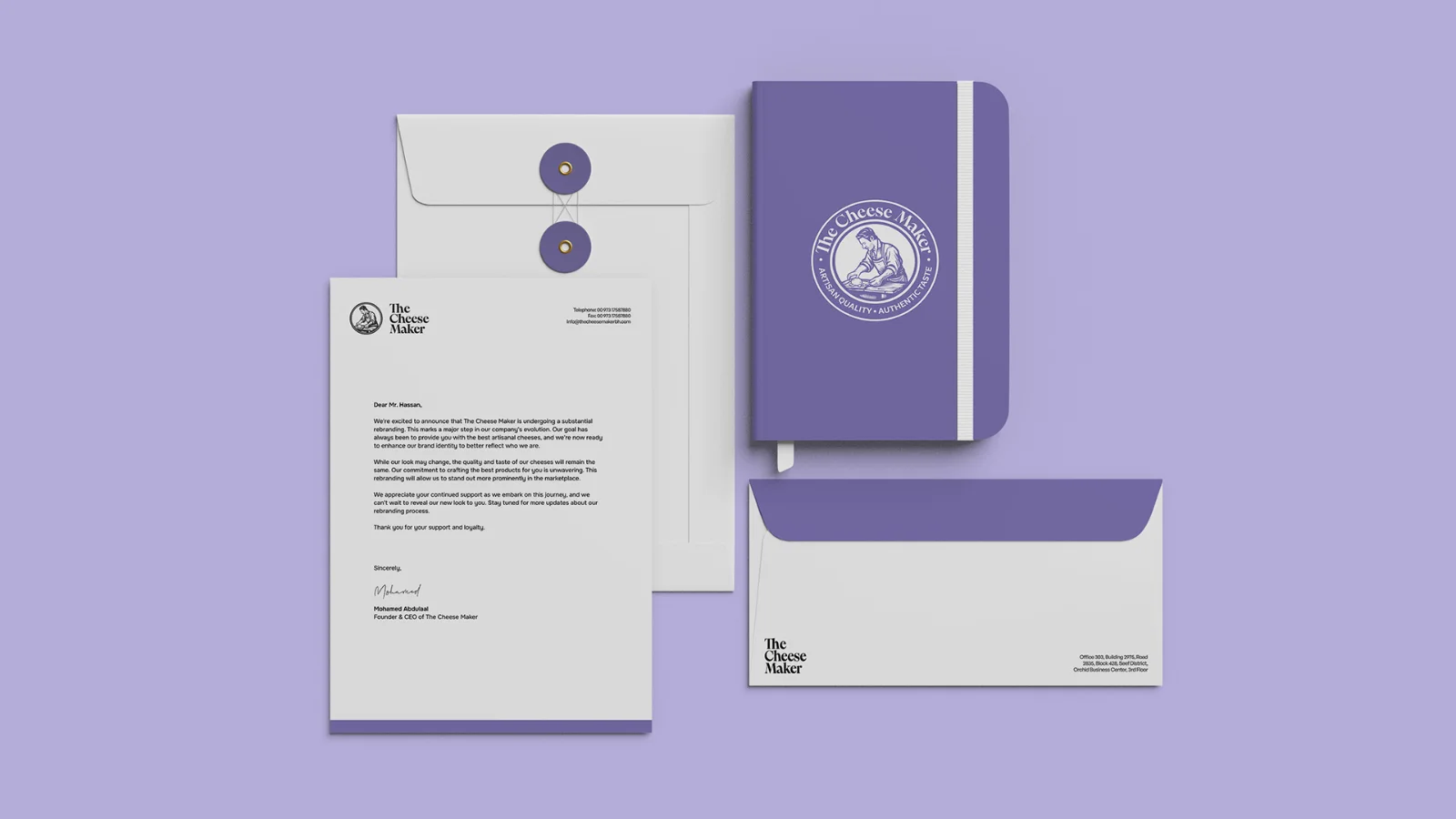
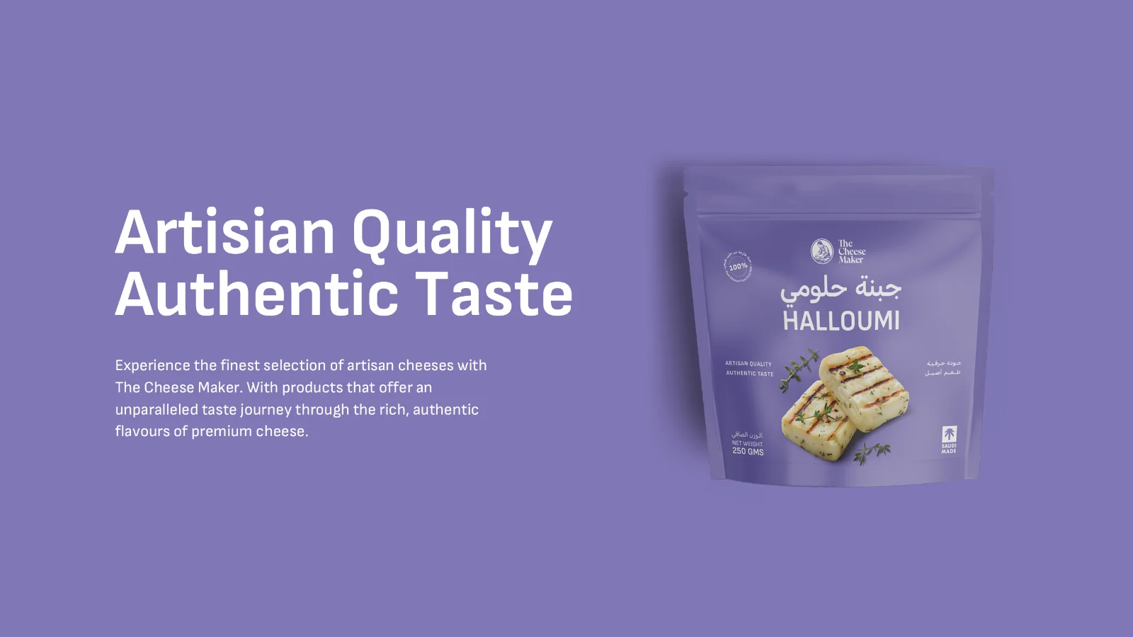
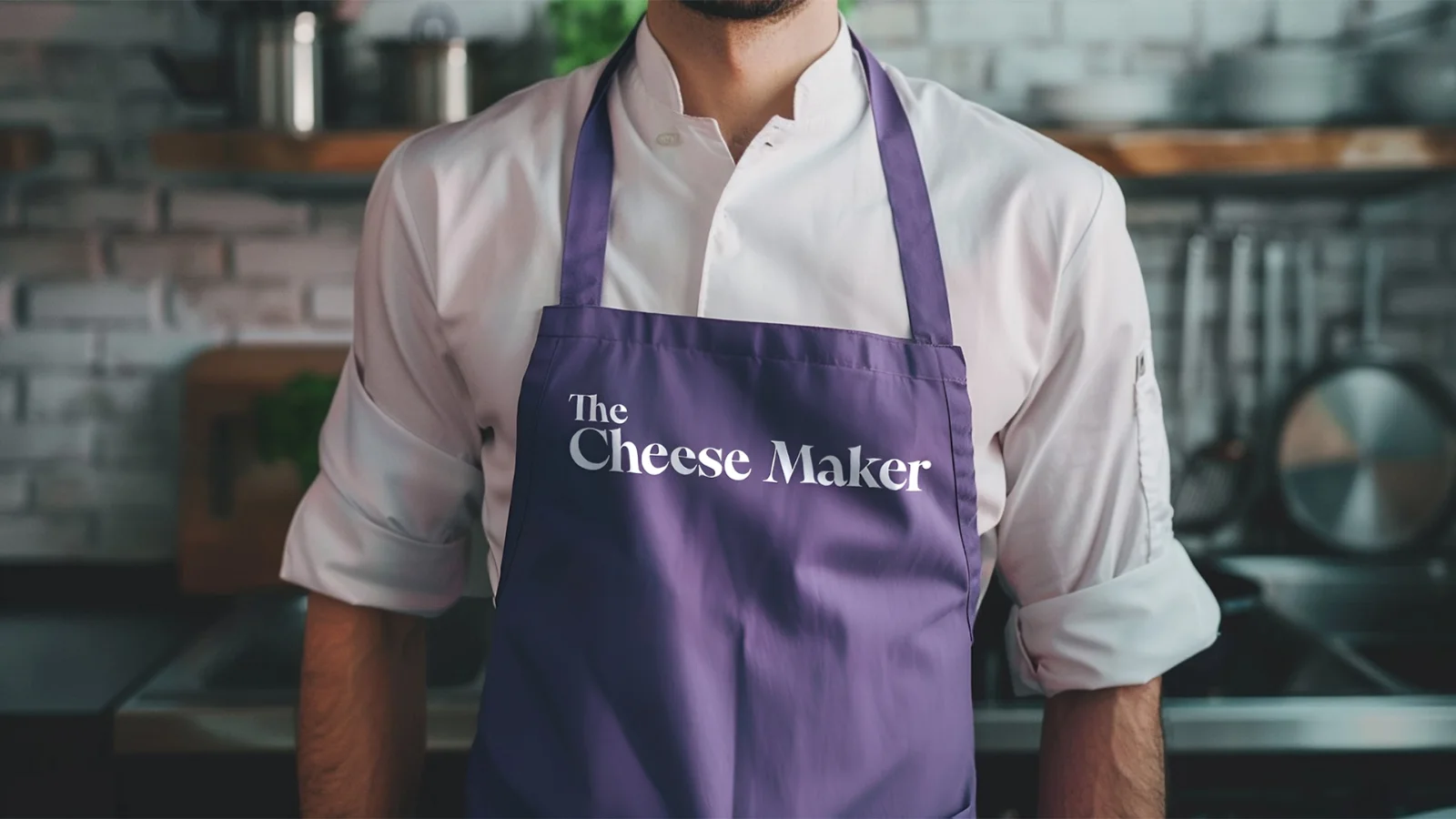
We redesigned the logo around an illustration of the founder, making the person behind the products the most recognizable element of the identity. Paired with refined typography and a contemporary visual approach, the result brings a more personal, authentic character to the brand, celebrating the individual and craftsmanship behind every cheese.
A Color to Remember
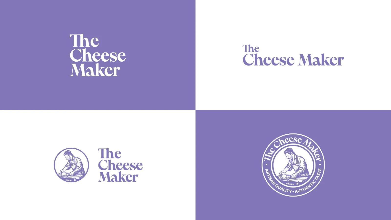
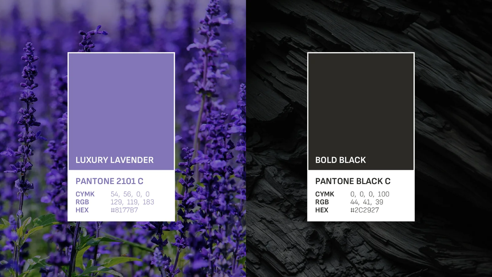
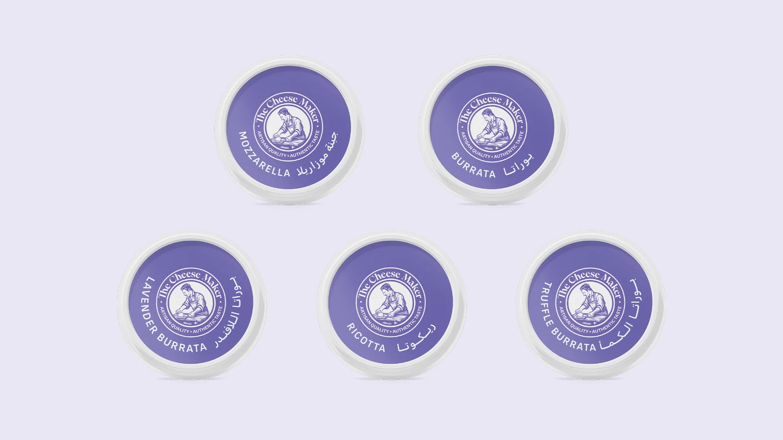
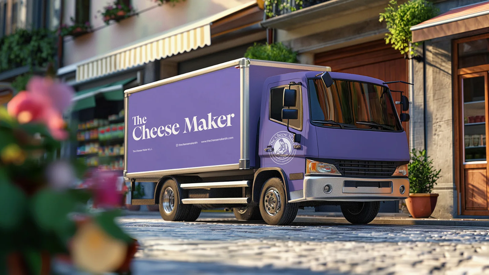
A rich lavender became the defining color of the new identity, introducing an unexpected sense of sophistication in a category traditionally associated with softer, more neutral tones.
Chosen with the brand's regional ambitions in mind, particularly in Saudi Arabia, the color draws on associations with hospitality, generosity, and prestige. Beyond its cultural relevance, it creates a striking contrast against the natural whites and creams of fresh cheese, giving the brand a distinctive presence on the shelf.
Paired with refined typography and a restrained supporting palette, the color brings together warmth and sophistication, establishing a visual language that feels premium without losing its approachable character.
Fresh Looks Good
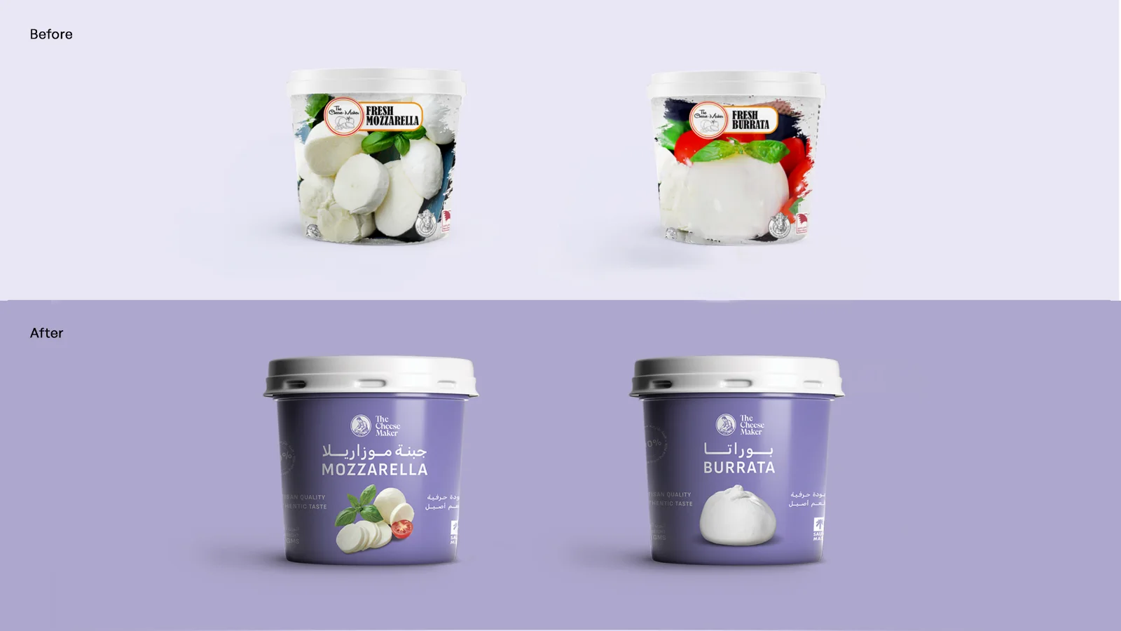
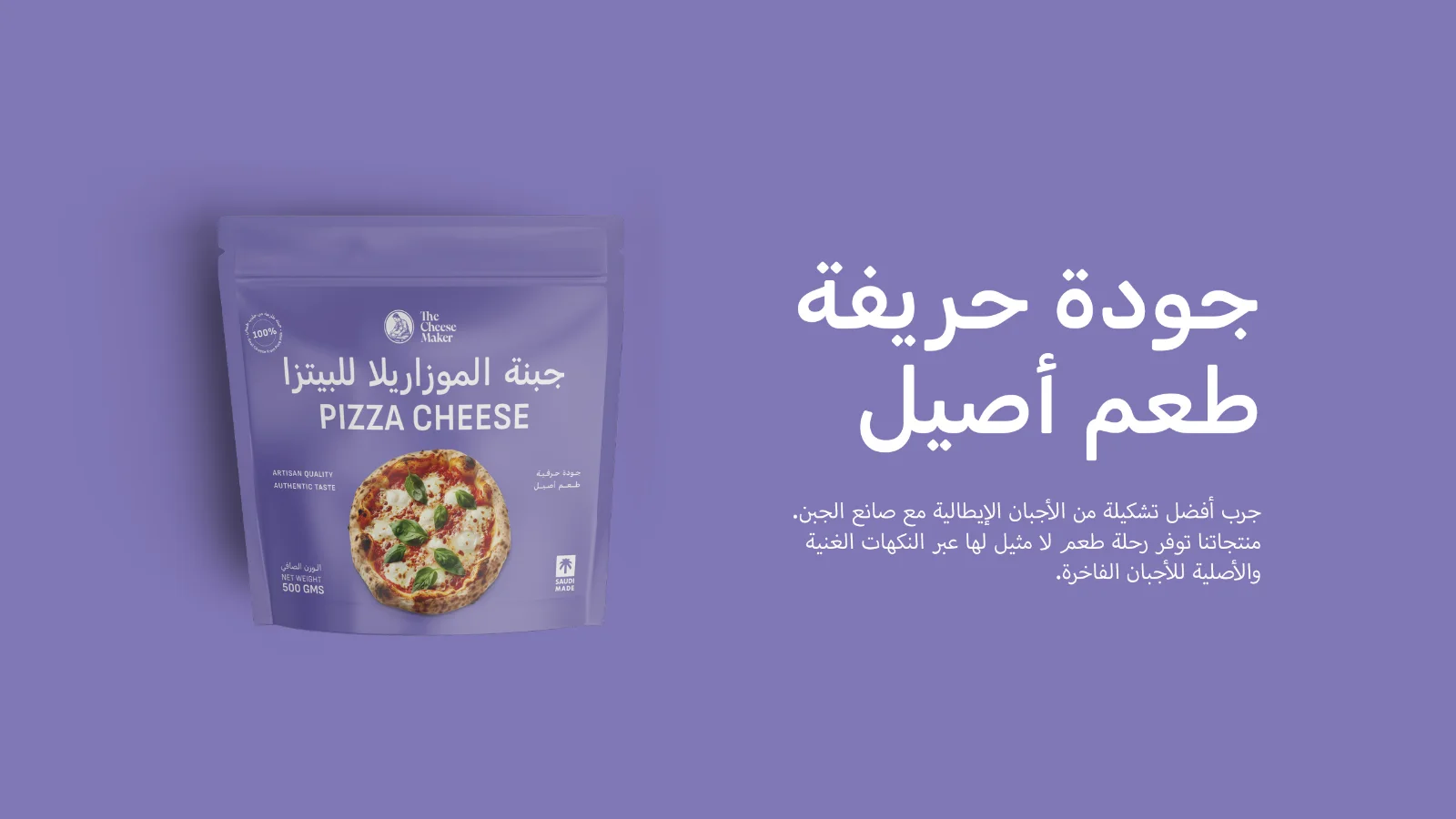
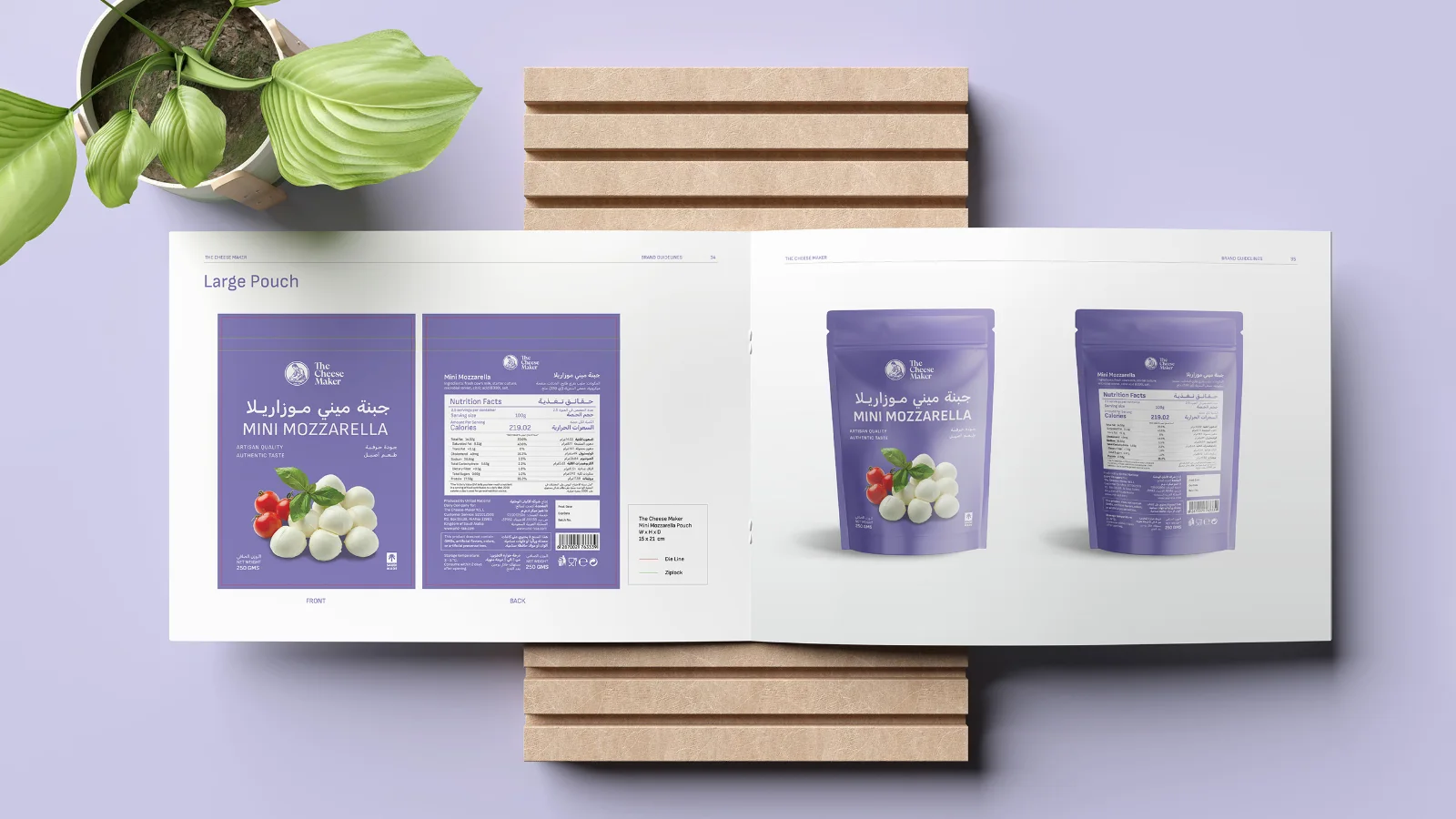
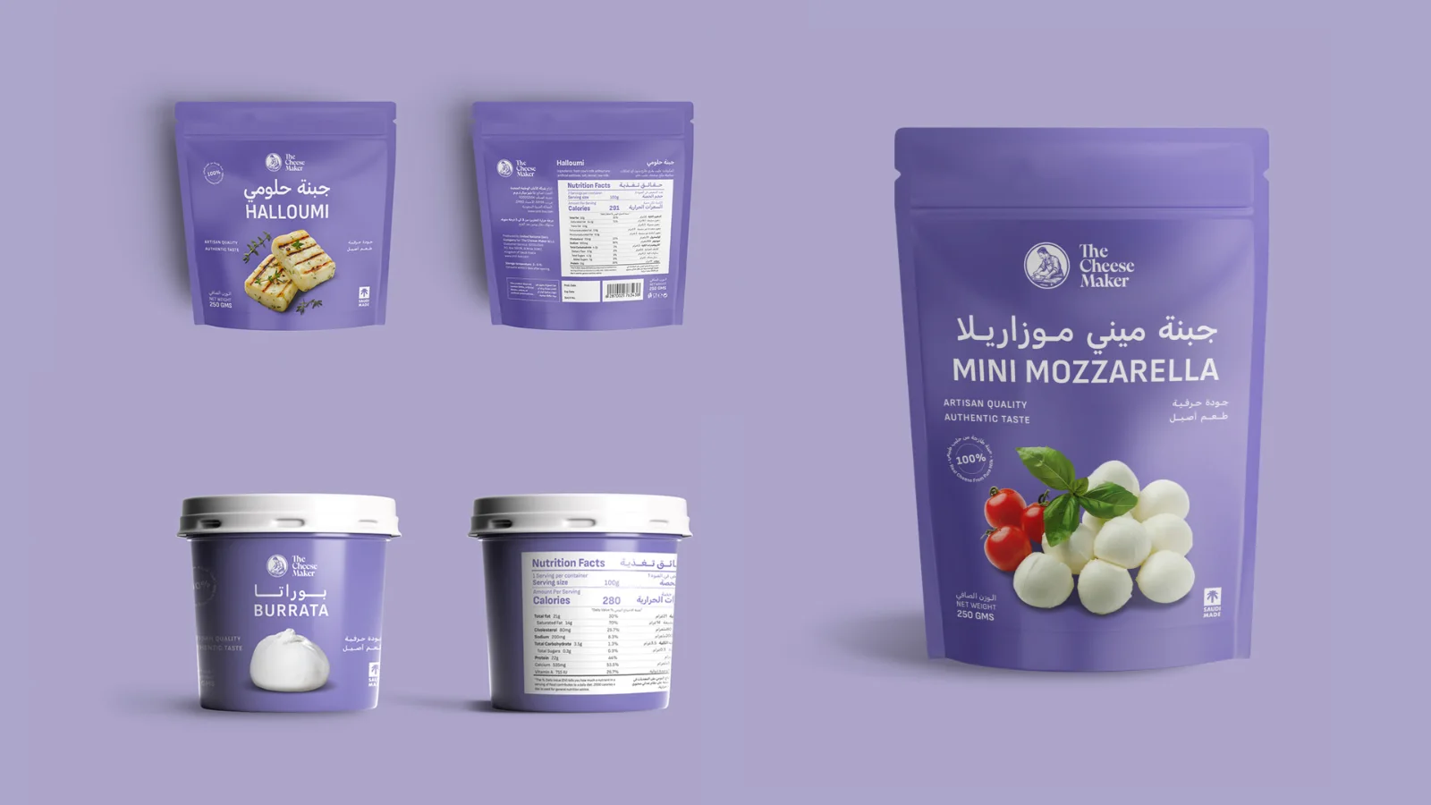
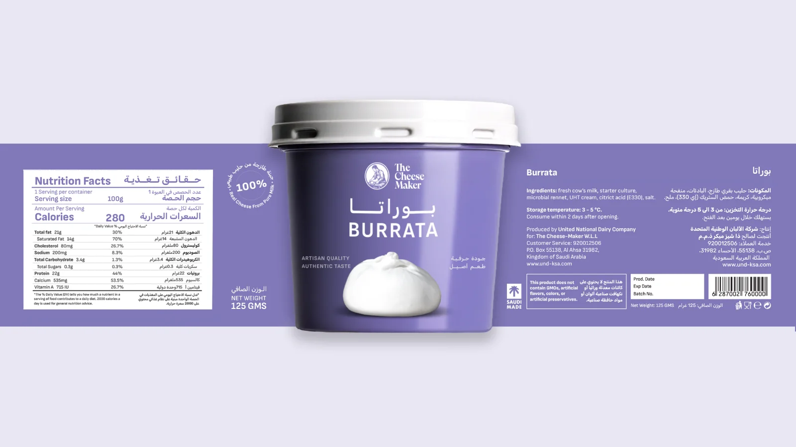
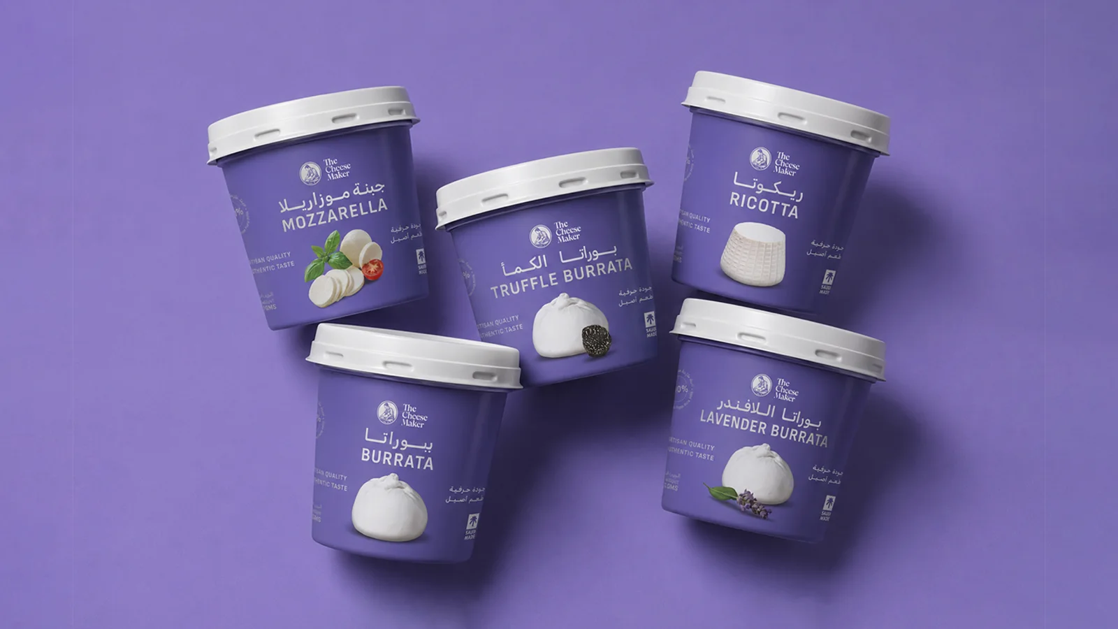
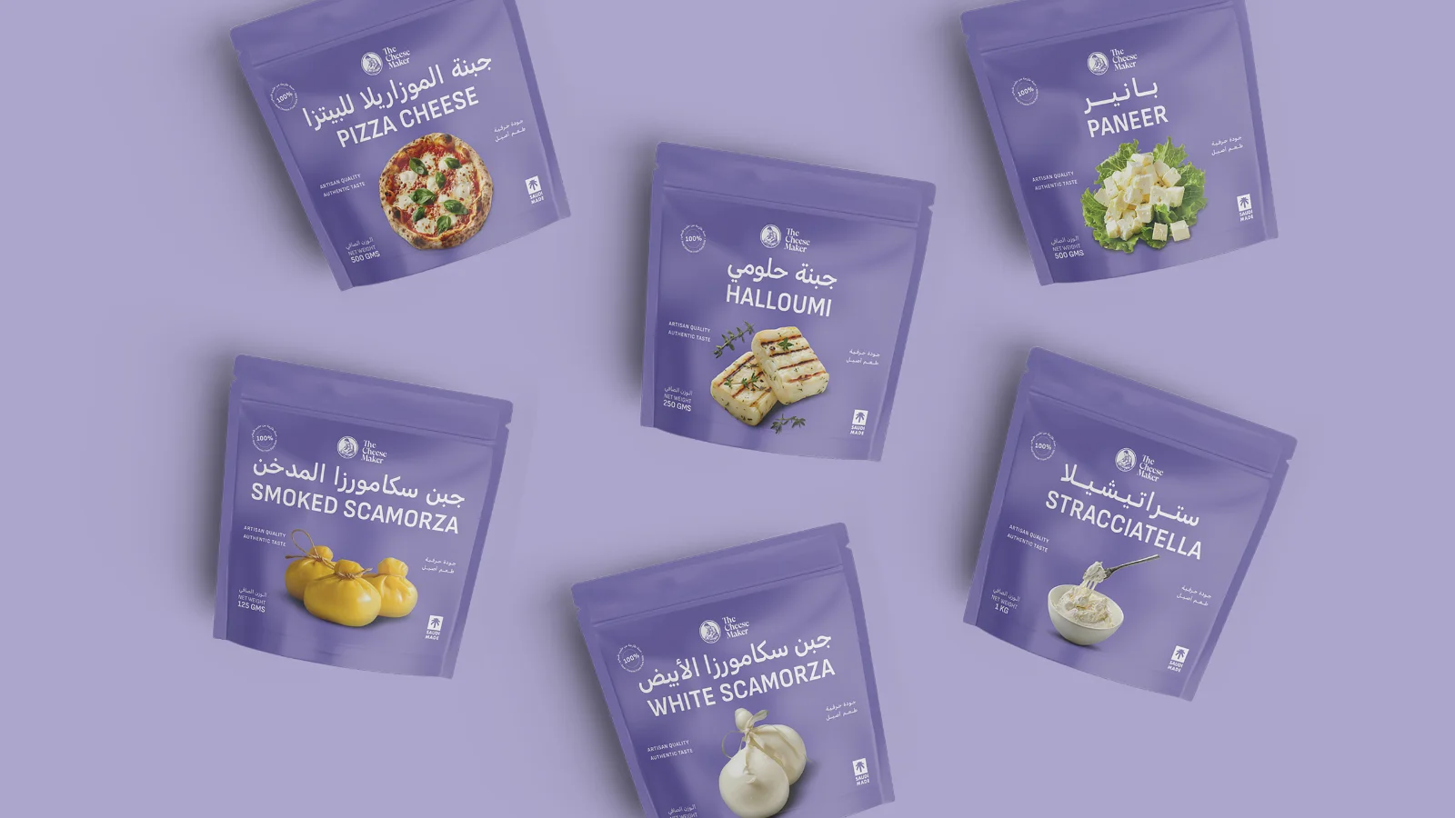
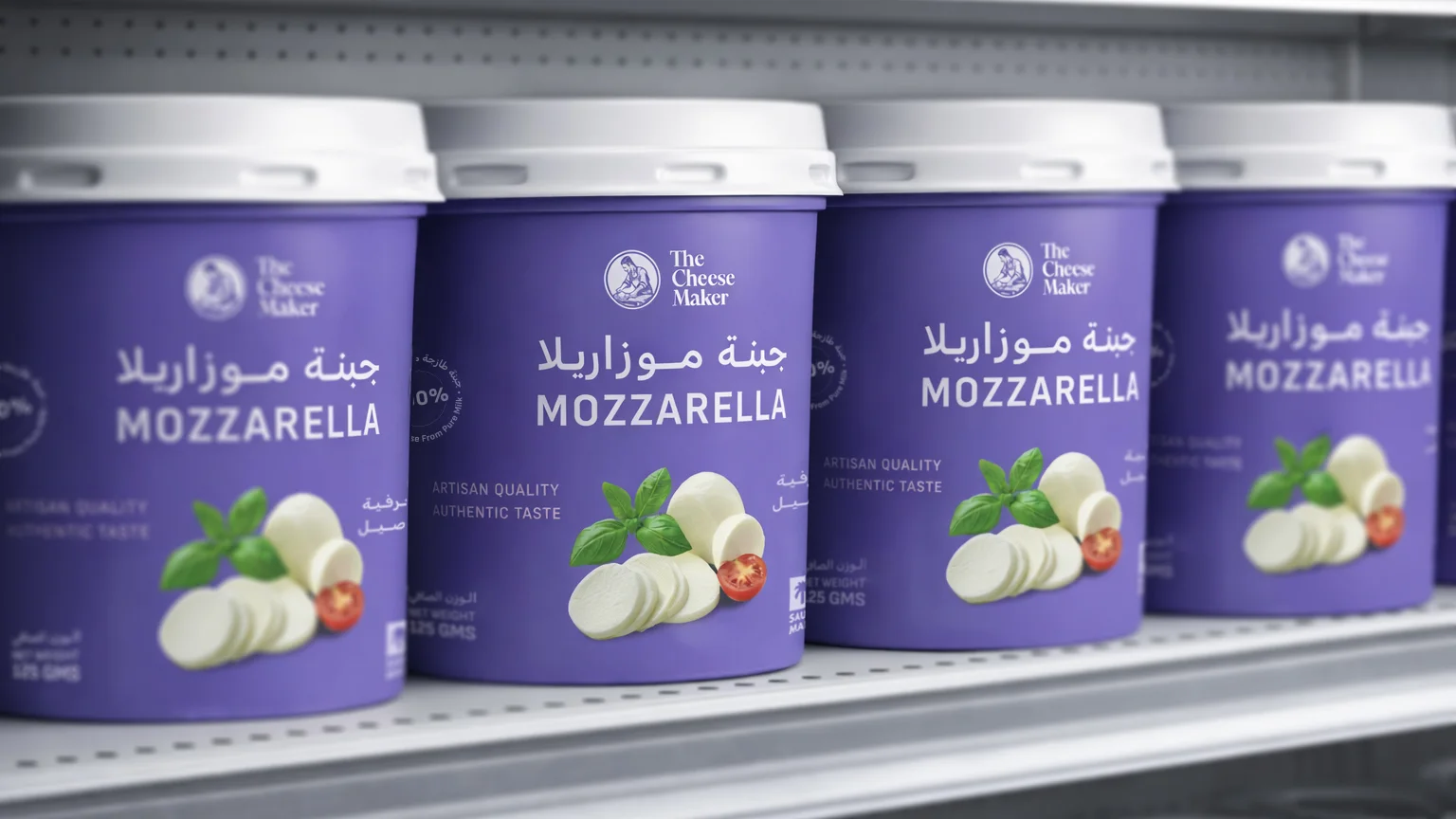
Packaging played a central role in bringing the new identity to life. We developed a cohesive packaging system across the product range, balancing brand recognition, clear product information, and an elevated presentation that allows the cheese itself to remain the focus.
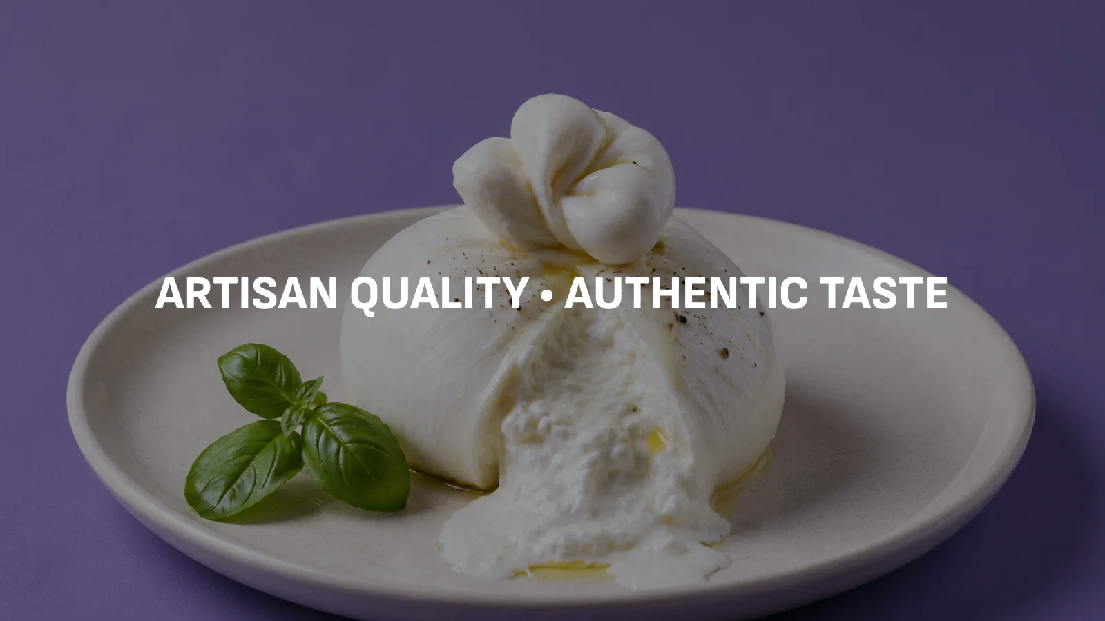
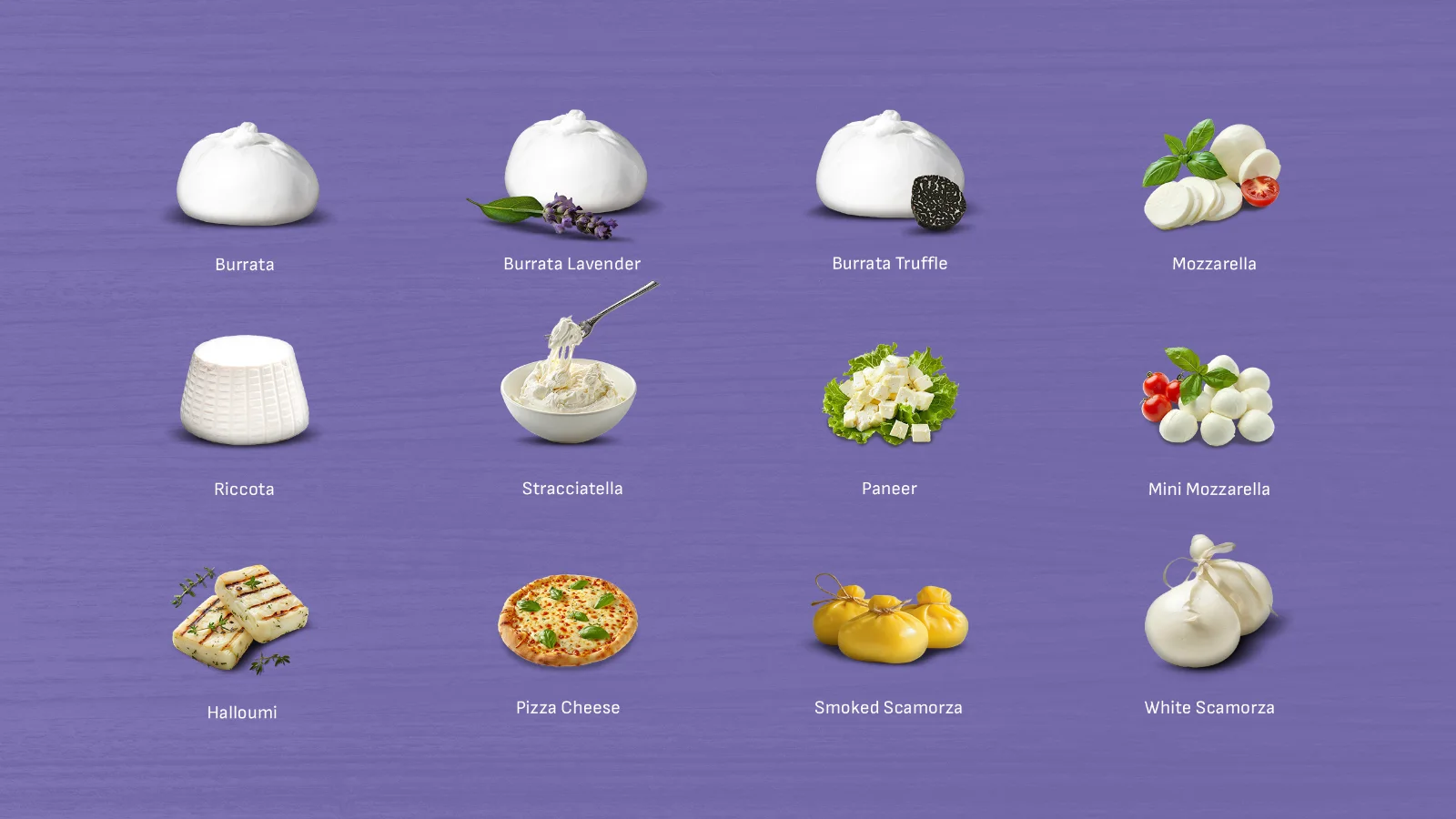
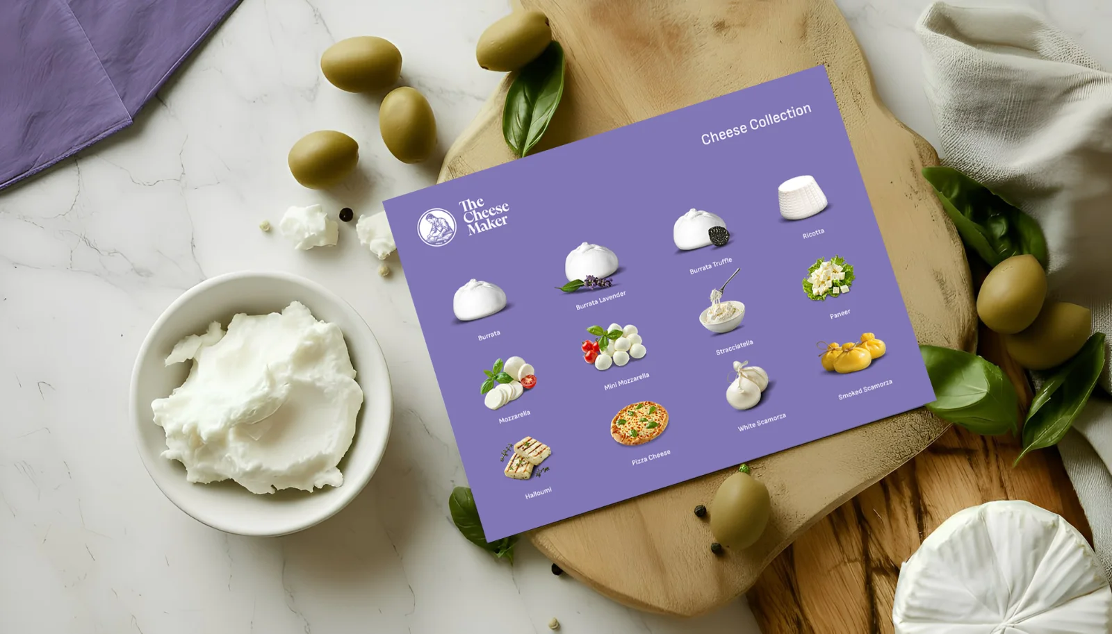
The visual language was complemented by art-directed product imagery, capturing the freshness, textures, and appetising qualities of the cheeses. Together, the packaging and photography create a consistent brand experience, translating The Cheese Maker's commitment to quality into something customers can recognise before they take their first bite.
More projects