Quick thought.
What’s the last thing you photocopied?
Probably something boring. Documents, forms, passport copies. That’s what photocopiers are for, right?
But that’s not the whole story.
It didn’t start as a creative tool 🧠
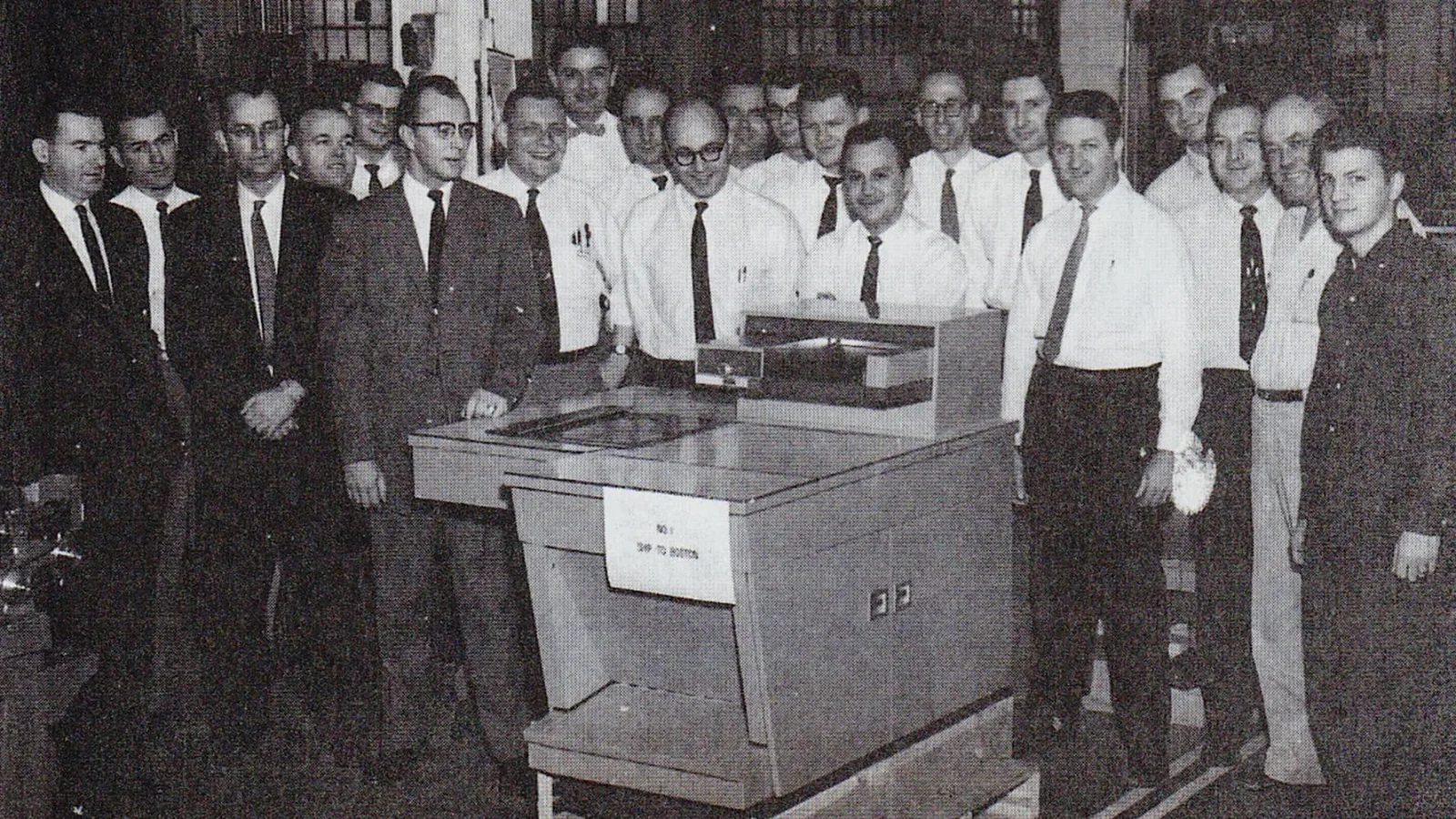
When the Xerox 914 dropped in 1959, it changed offices overnight. Copying became fast, cheap, and everywhere.
And like any tool that becomes accessible… people start messing with it.
Then creatives got involved 🎸
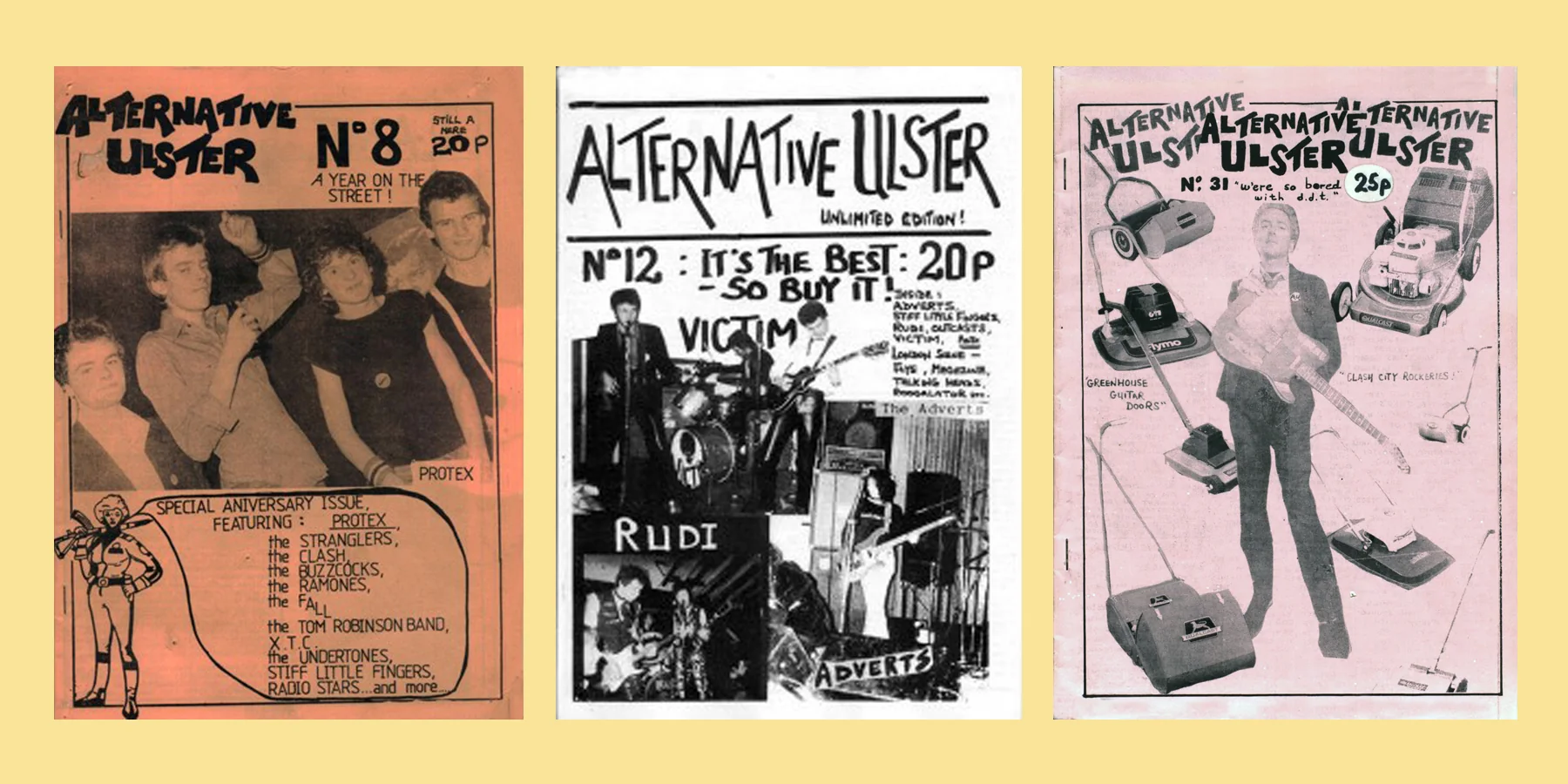
Photocopiers ended up in the hands of artists, musicians, and underground scenes.
That’s when things got interesting.
Zines, punk flyers, DIY posters. Everything felt raw, fast, and unapologetic. The low quality was not a flaw anymore. It became the look.
Grain. Blur. Harsh contrast.
All the “mistakes” suddenly had attitude.
Imperfection in Motion
Instead of polishing everything, people leaned into texture.
You see this in film title sequences and visuals too. Rough, scanned textures carry emotion that clean digital work sometimes lacks. (They instantly drag you into the world you are about to immerse yourself in)
Because when you scan something, you are not just copying it.
You capture pressure, light, and all the tiny imperfections that make it feel real.
Title sequences like Se7en and Napoleon Dynamite, where texture isn’t just visual, it sets the tone from the first second.
In Se7en, everything feels tense. The typography flickers, scratches, almost breaks apart. It looks damaged on purpose. The roughness builds discomfort before you even know the story.
Then Napoleon Dynamite goes in a completely different direction. The titles are made using real objects, like food arranged by hand. It feels awkward, random, and very human. That awkwardness becomes part of the charm.
And then there’s Juno.
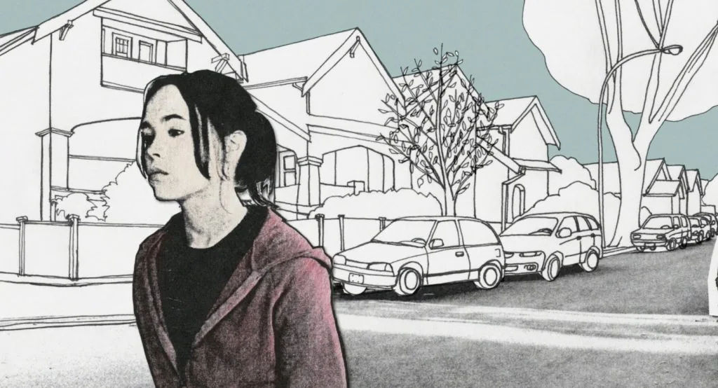
The Juno title sequence leans into a handmade, illustrated style. It mixes live action with hand-drawn frames, creating this textured, slightly imperfect animation. It feels personal, almost like a sketchbook coming to life.
Nothing is overly polished. The movement has a rawness to it. You can feel the process behind it.
The process becomes the design 🔄
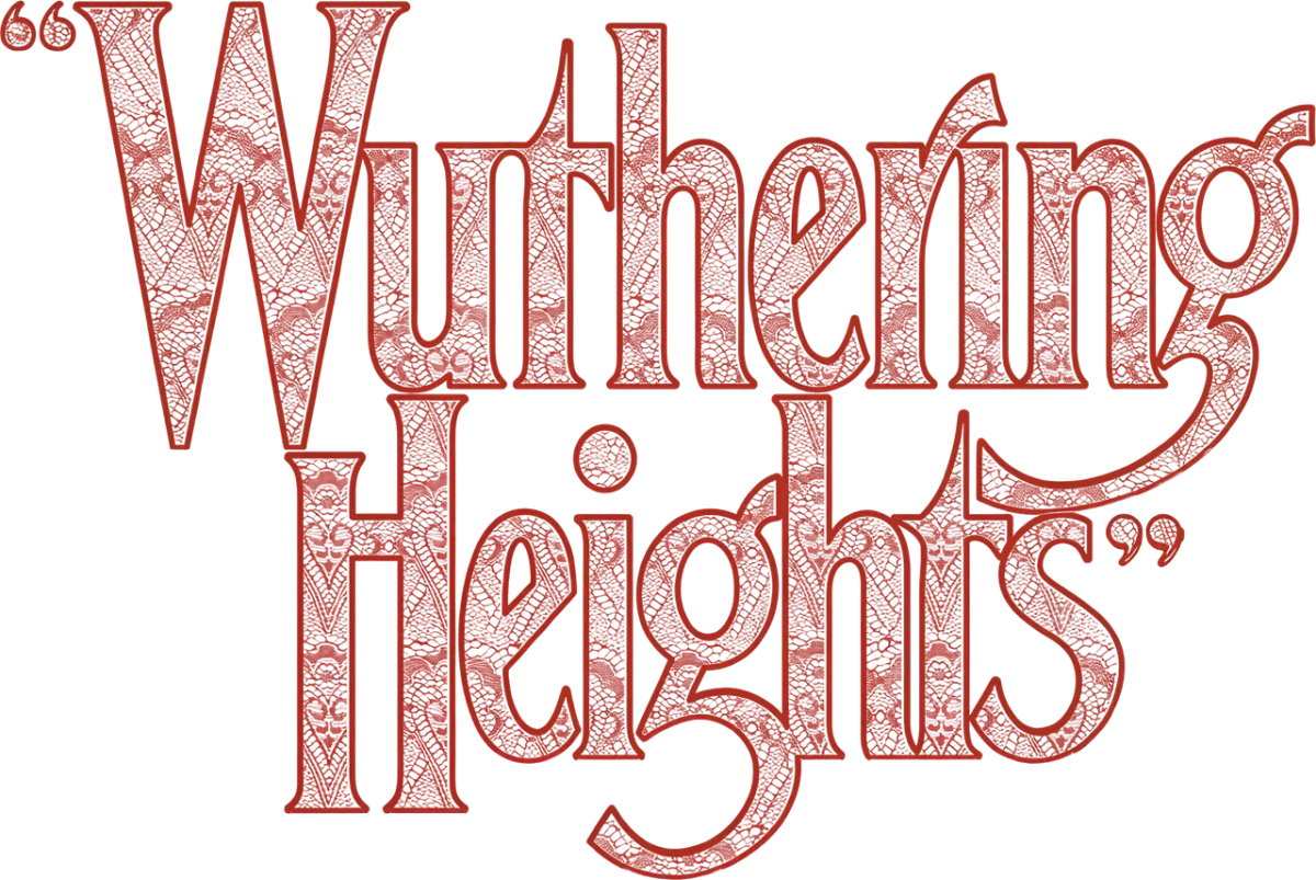
For the Wuthering Heights (2026) title, the typography wasn’t just designed cleanly and then styled. It was physically manipulated first.
The letterforms were compressed until they almost “kissed” each other. That alone already changes the feeling. It creates tension, intimacy, something slightly uncomfortable but romantic at the same time.
Then it gets even more interesting.
The lace texture used in the design wasn’t a digital brush or stock image. It was created by scanning a real material. Something physical, something with history and imperfection built into it.
The scanner becomes a camera 📸
At some point, the scanner stops being just a machine.
It becomes a creative tool.
You can:
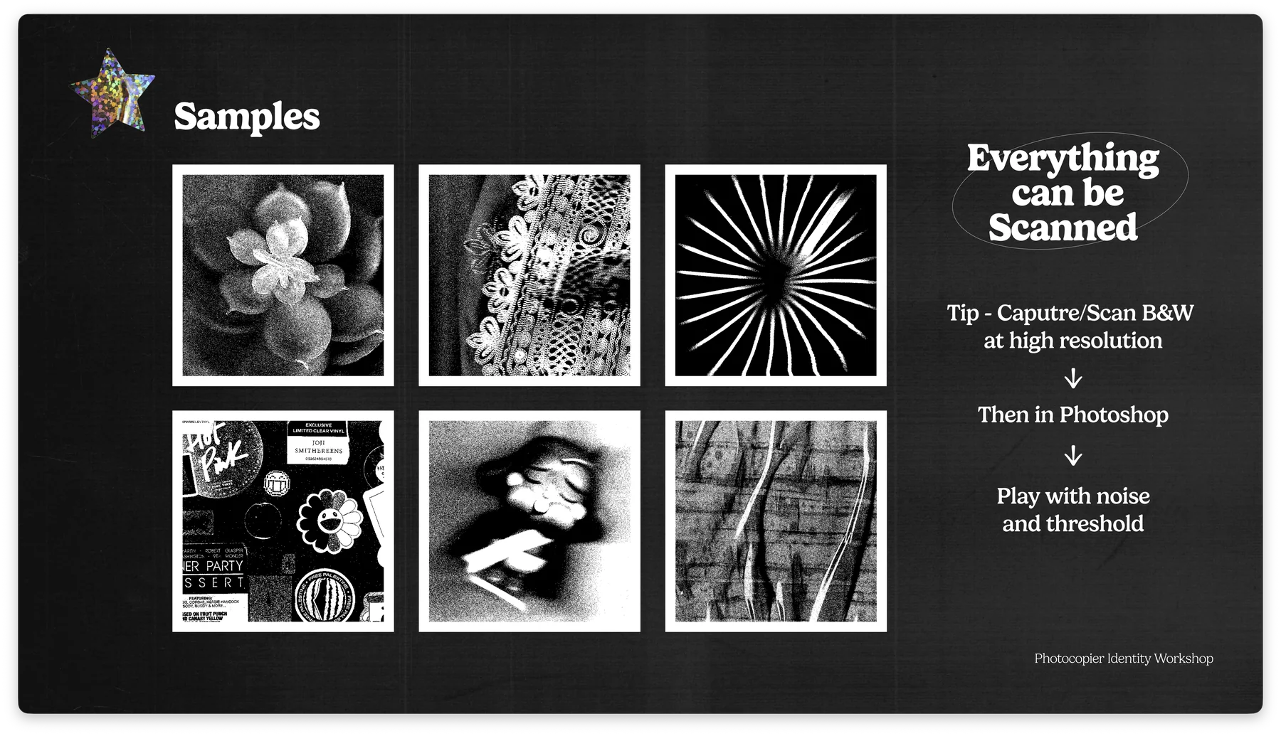
Move objects while scanning, like a physical art board!
Press them down for distortion
Layer multiple scans
Experiment with whatever is around you
The results are unpredictable, and that is exactly the point.
Honestly, you can scan anything 🔍
Fabric. Paper. Hands. Random objects.
A simple tip from the presentation
Scan in black and white, high resolution. Then push contrast, noise, and threshold after.
That is where things start to feel unique.
The takeaway 💡
Photocopiers were never meant to be creative tools.
But they became one anyway.
And maybe that is the bigger idea.
Good design does not always come from new tools.
Sometimes it comes from using familiar ones… differently.