Innotaqa
A dynamic brand identity for a sustainable energy solutions company.
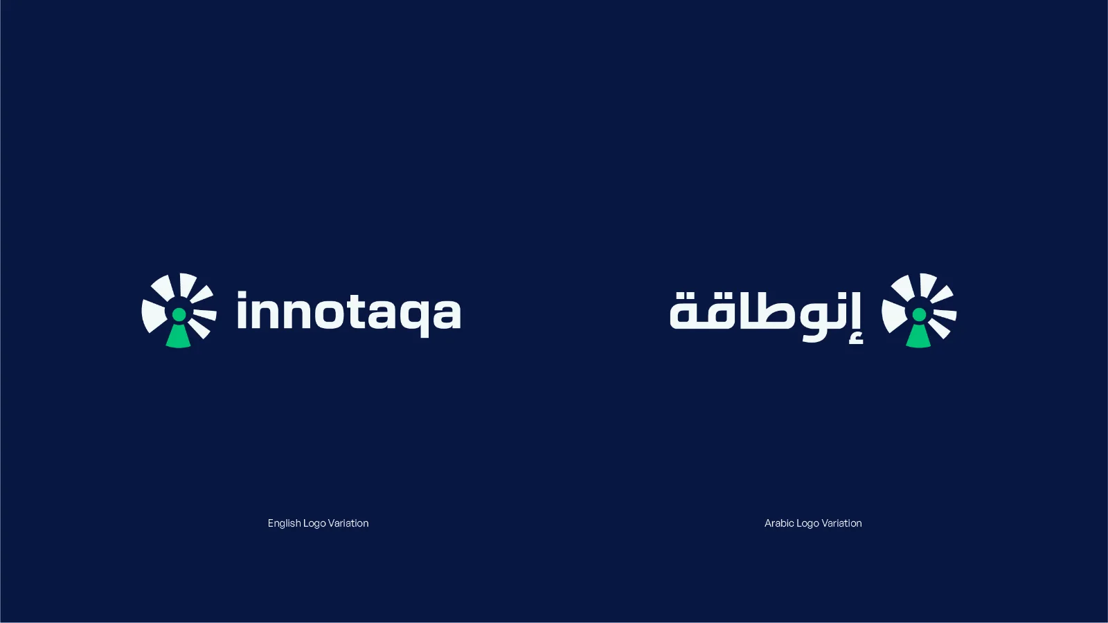
Innotaqa is a Bahraini startup providing sustainable energy solutions through consultancy, research and development, and purpose-built products for businesses and government entities. Limefish developed a refreshed brand identity, comprehensive brand guidelines, and a social media kit to give Innotaqa a clear and cohesive foundation for growth.
A Clean Start
Driven by the ambition to fight pollution and help Bahrain move towards a zero-emissions future, Innotaqa was entering a new stage of growth. It needed a brand that could communicate its vision with greater clarity, reflect the evolving market it aimed to serve, and establish it as a credible force within the sustainable energy sector.
While its existing logo identified the business by name, the wider identity lacked the depth needed to communicate what Innotaqa stood for. Speaking to a broad B2B audience, including private businesses, government entities, investors, and decision-makers, required a more distinctive and expressive visual system.
The goal was to create a custom visual language that felt personal to Innotaqa, with enough depth to tell its story, support its ambitions, and bring the meaning behind its name, “innovative energy,” to life.
Mapping Innovative Energy
We began by breaking down the ideas embedded within Innotaqa’s name and purpose. Through word mapping, we explored the relationships between innovation, energy, sustainability, nature, and motion, identifying the visual themes that could best represent the brand.
This process revealed an opportunity to move beyond the conventional symbols associated with the energy sector. Instead, the identity could communicate energy as a force of movement, transformation, and progress. The brand needed to feel dynamic and futuristic, mirroring the industry Innotaqa operates in while maintaining the credibility expected by its business and government audiences.
The Movement Towards Change
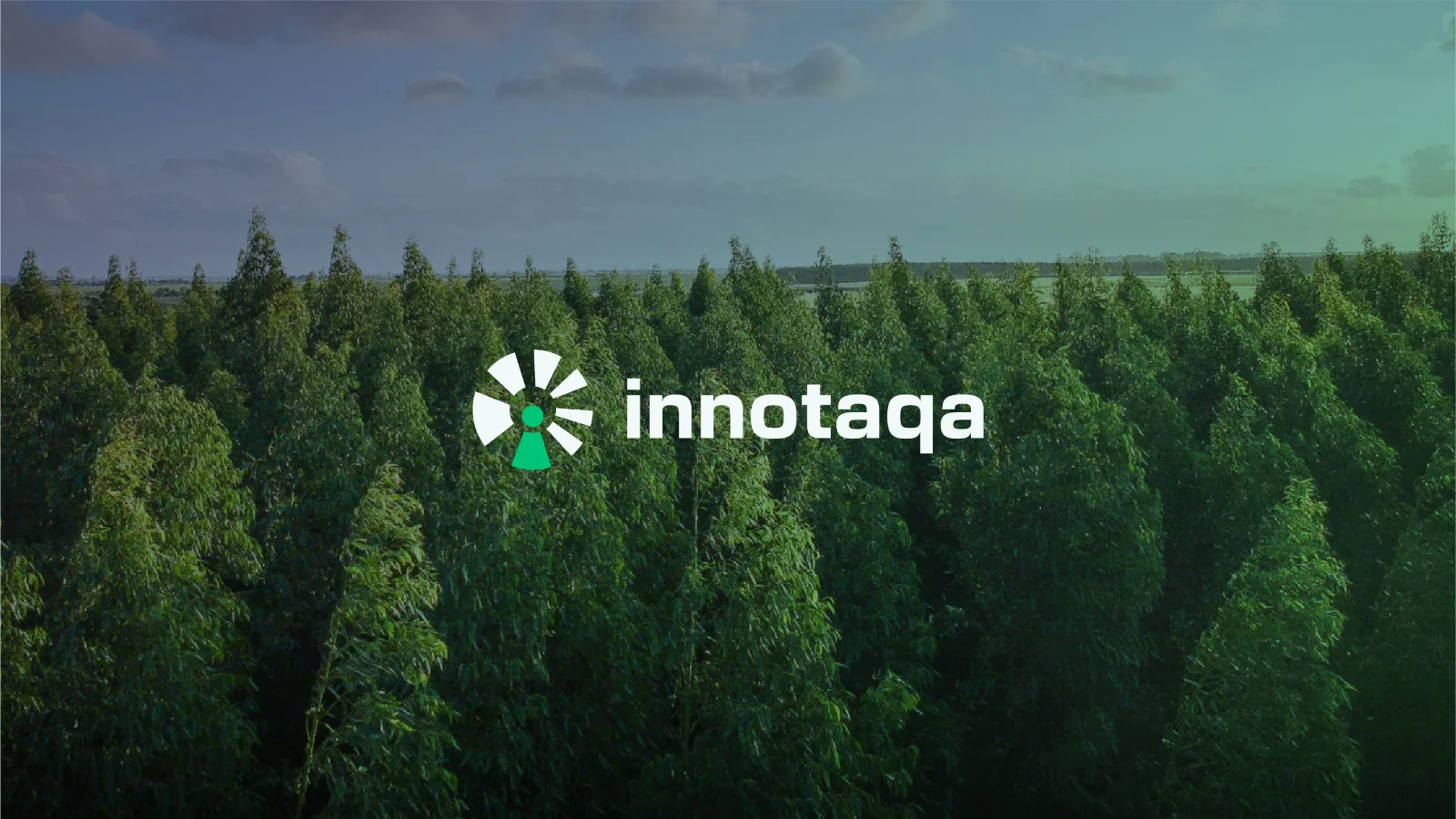
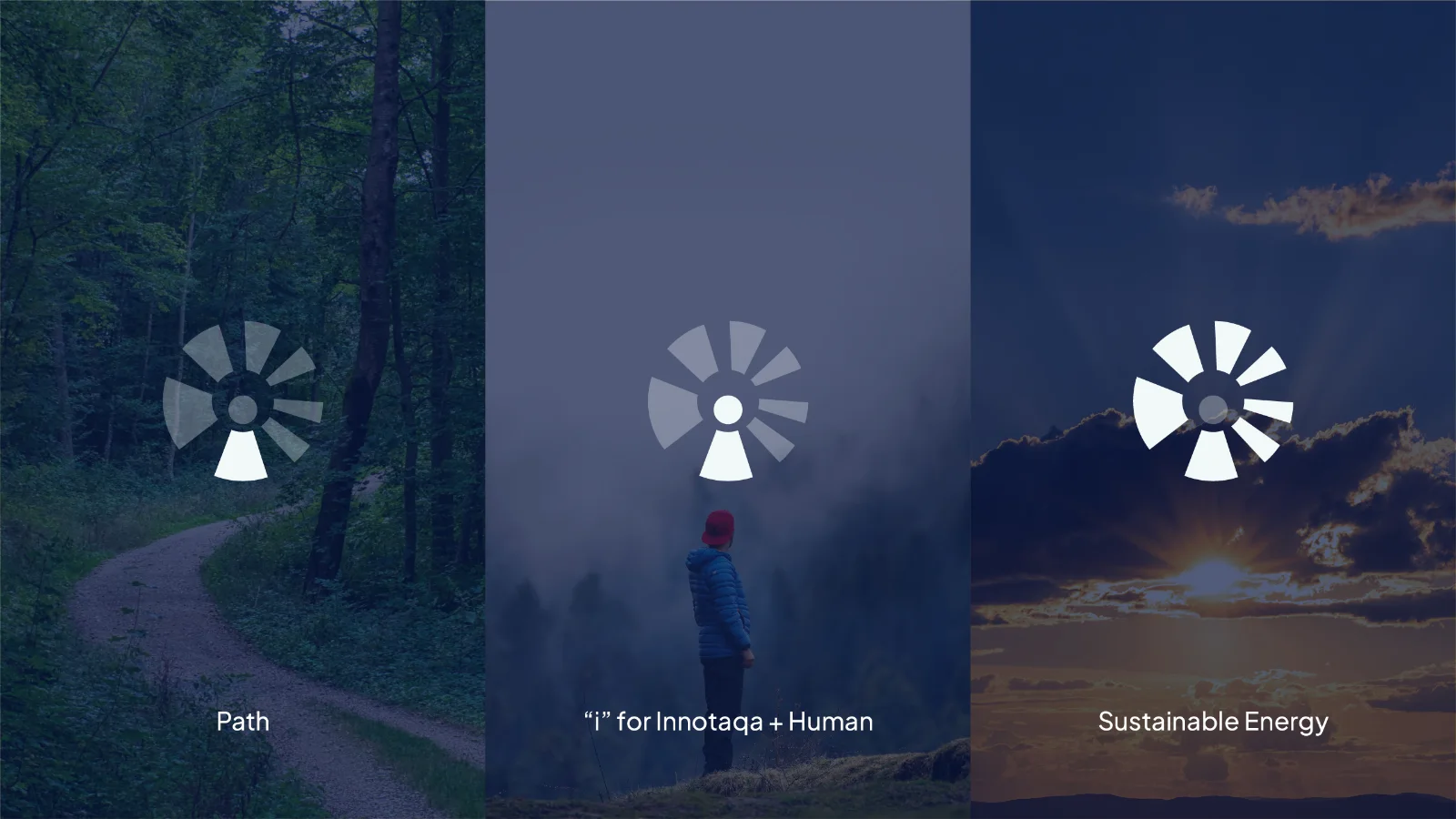
The creative direction brought together clean energy, innovation, and human progress through a simple radial symbol. Its forms reference the movement of wind and the rays of the sun, while the central composition incorporates a path and a human figure. Together, these elements position Innotaqa as a guide towards a cleaner and more sustainable future.
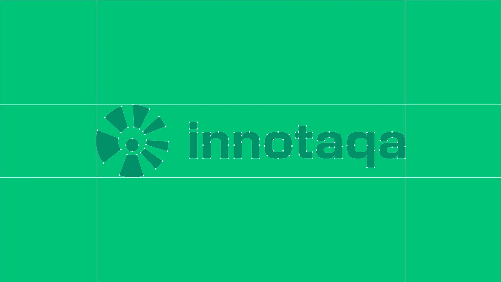
The radial movement represents transformation and Innotaqa’s role in driving change. Its asymmetry gives the mark a sense of motion and growth, creating a distinctive symbol that feels active, optimistic, and forward-looking.
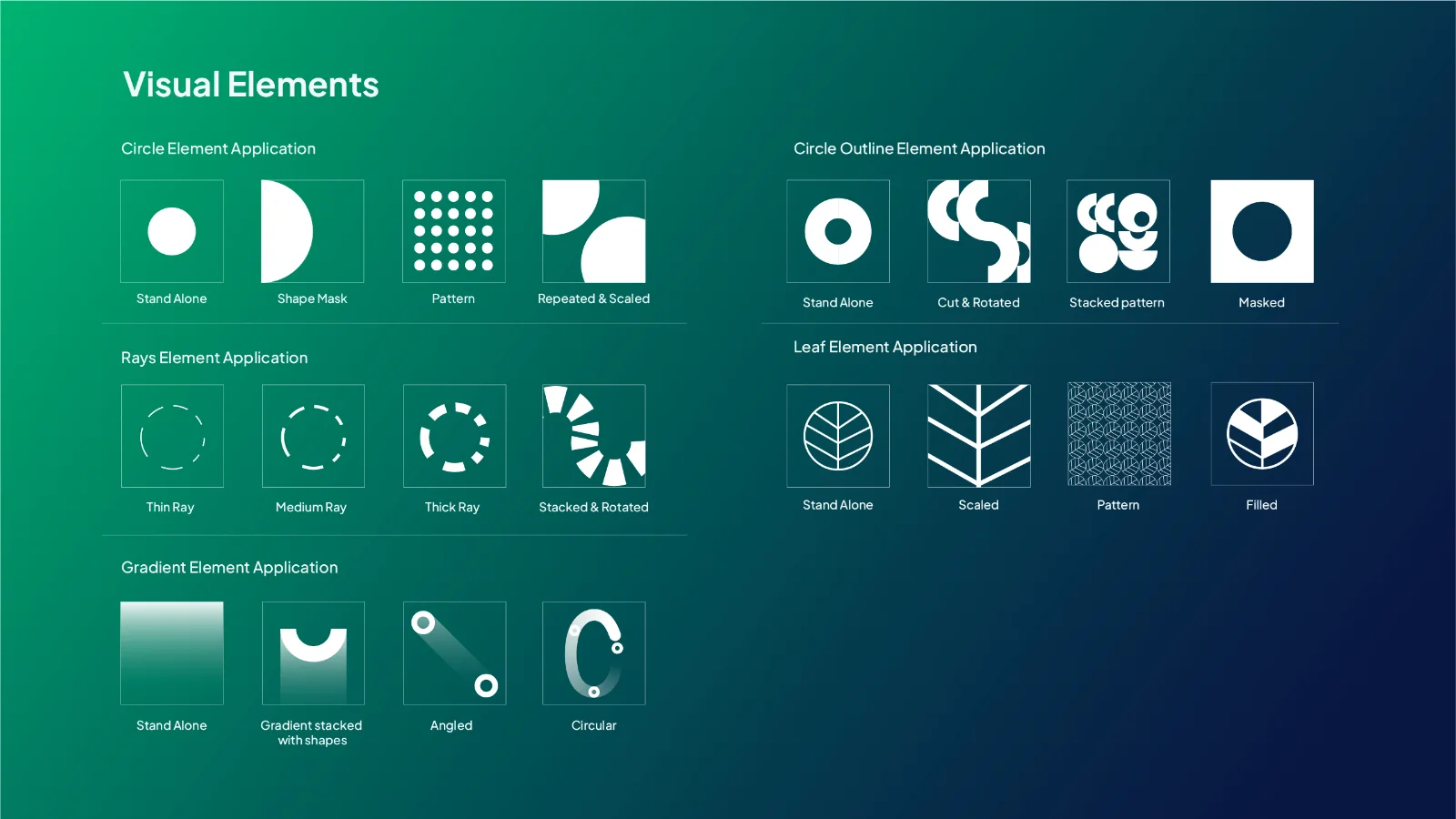
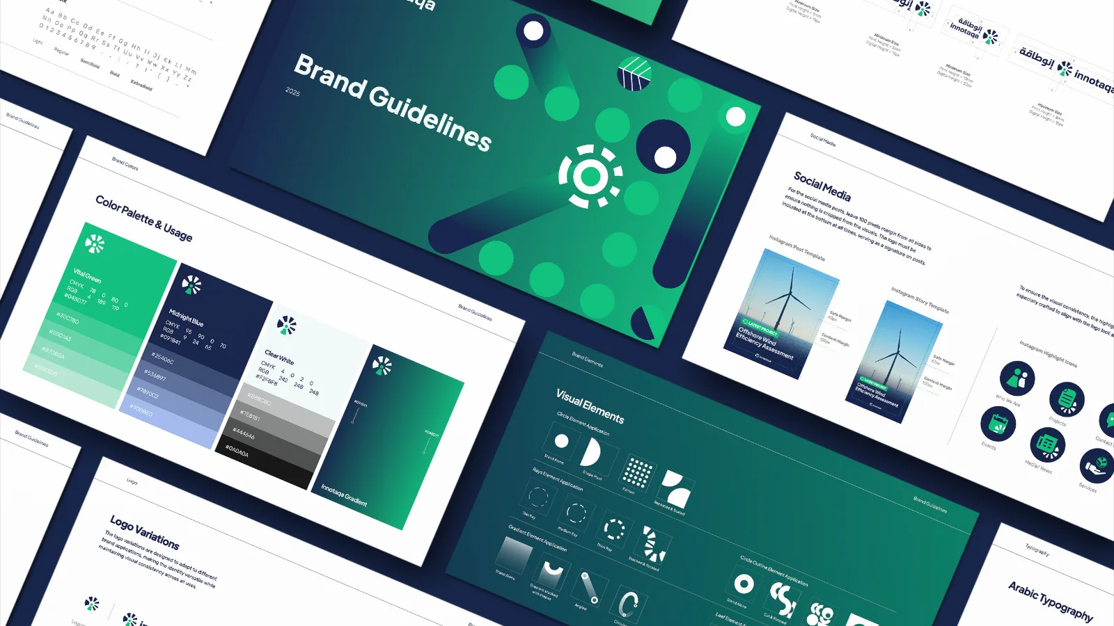
The symbol also became the foundation of a broader visual language. Circles, rays, gradients, and nature-inspired forms could be scaled, rotated, layered, repeated, and used as image masks. This created a flexible system capable of expressing innovation and movement consistently across different brand applications.
A System in Motion
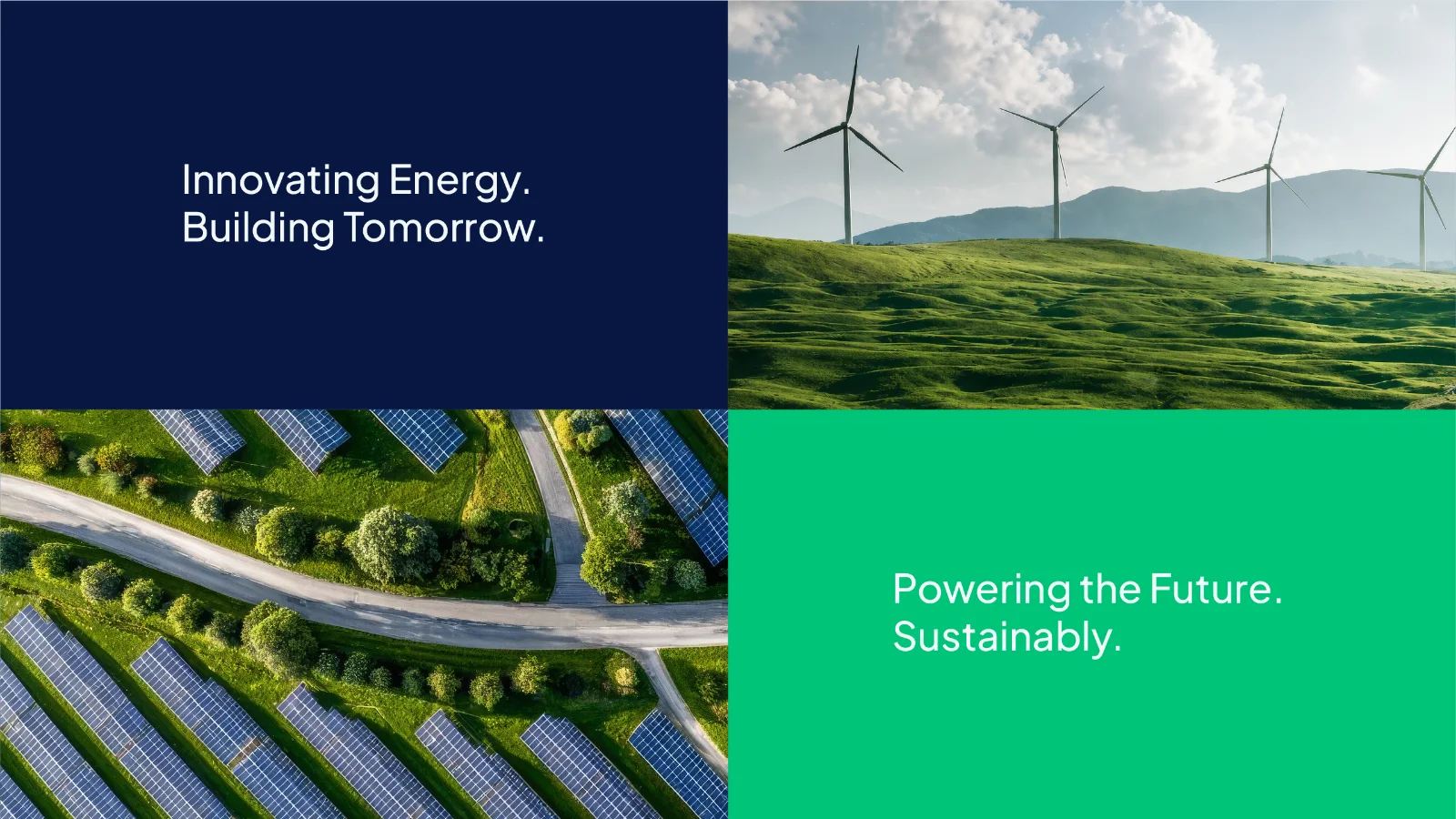
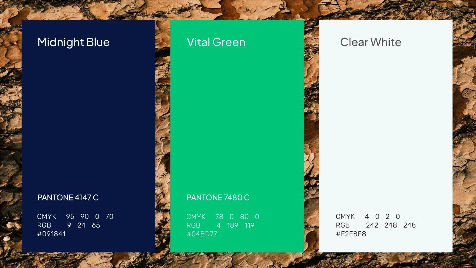
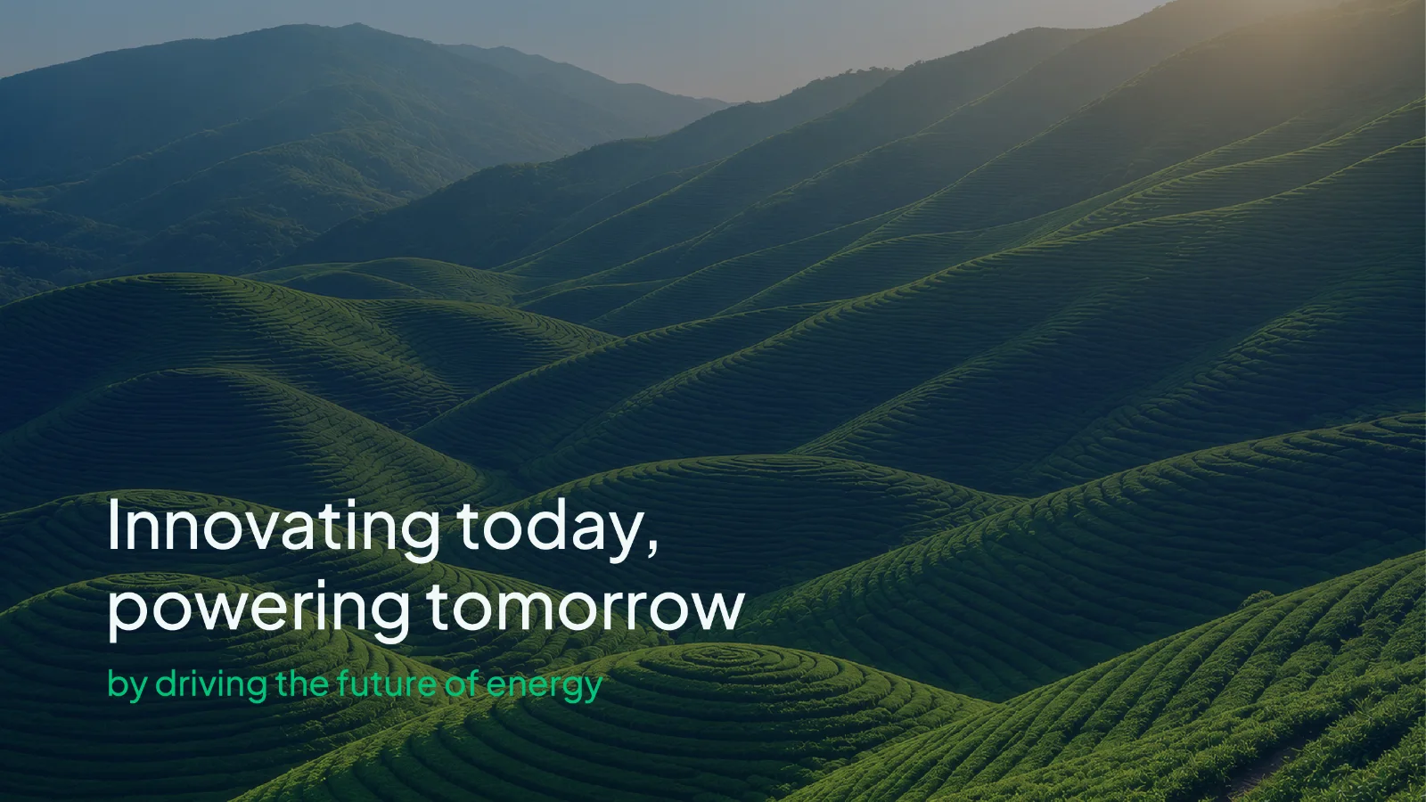
The color palette draws from Innotaqa's connection to clean energy and the betterment of nature. Deep navy and vibrant green balance professional authority with environmental relevance, creating an impression that feels energetic, dynamic, and bold.
Gradients add a further sense of energy and movement, representing innovation, transformation, and the transition towards cleaner forms of energy while bringing depth and vitality to the system.
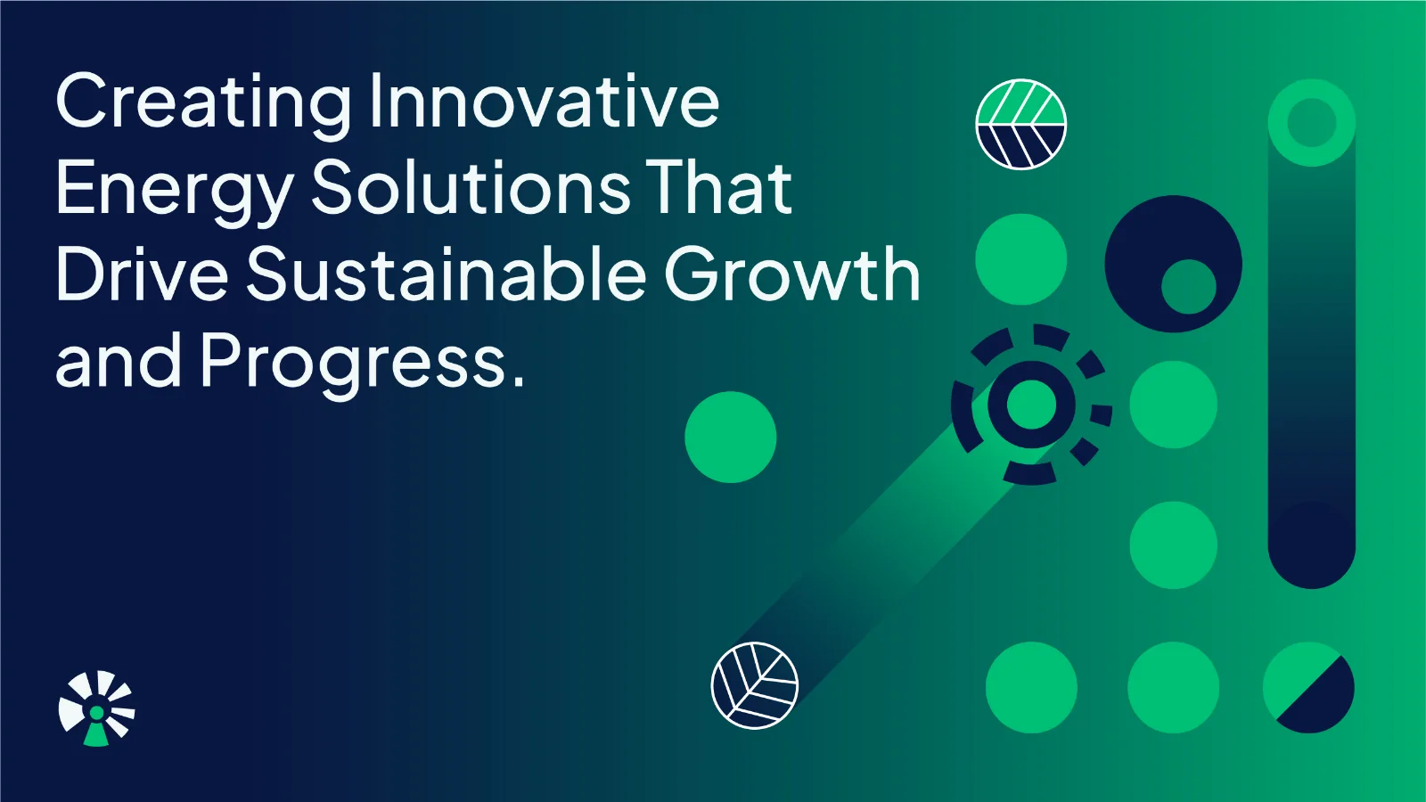
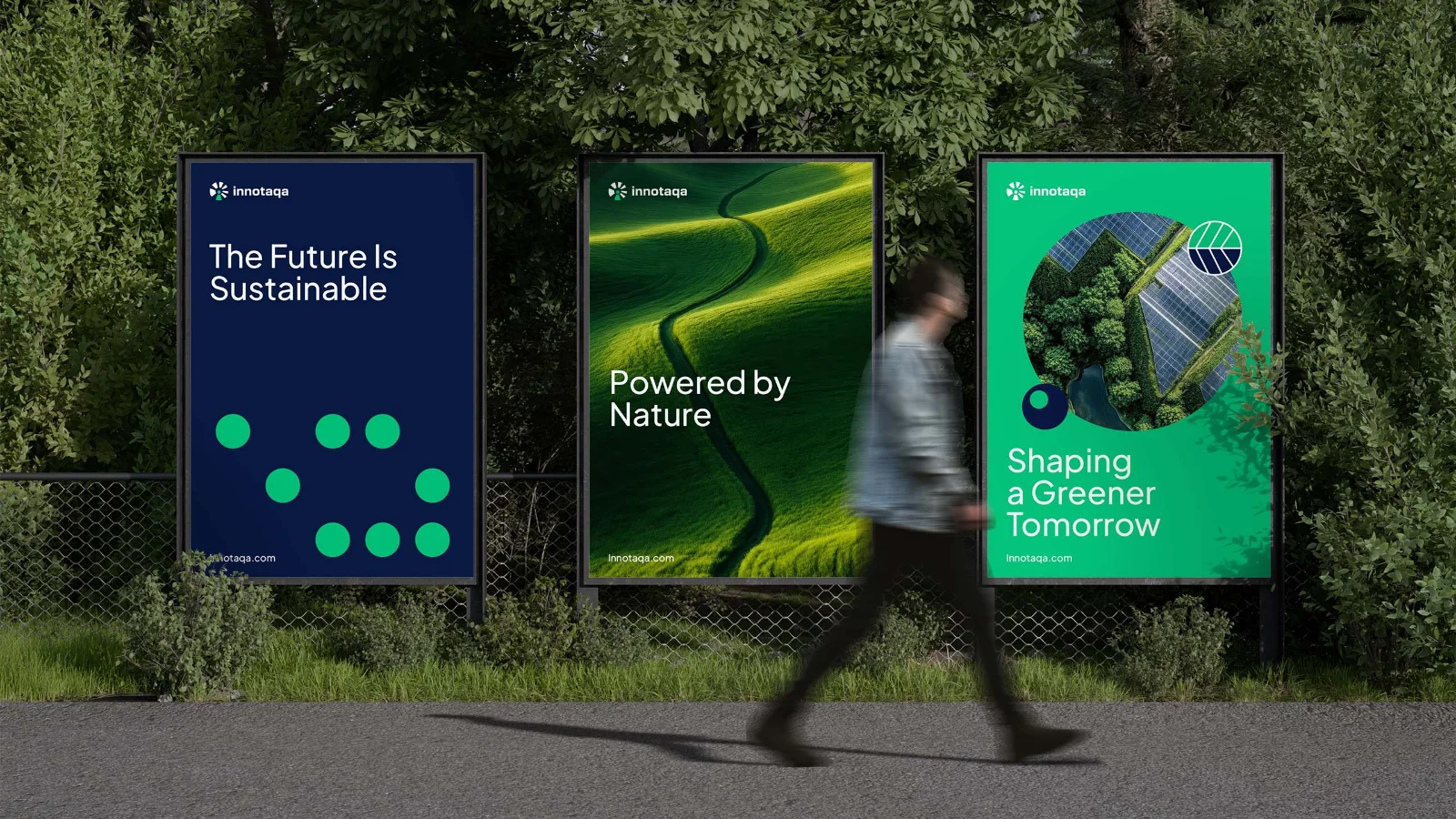
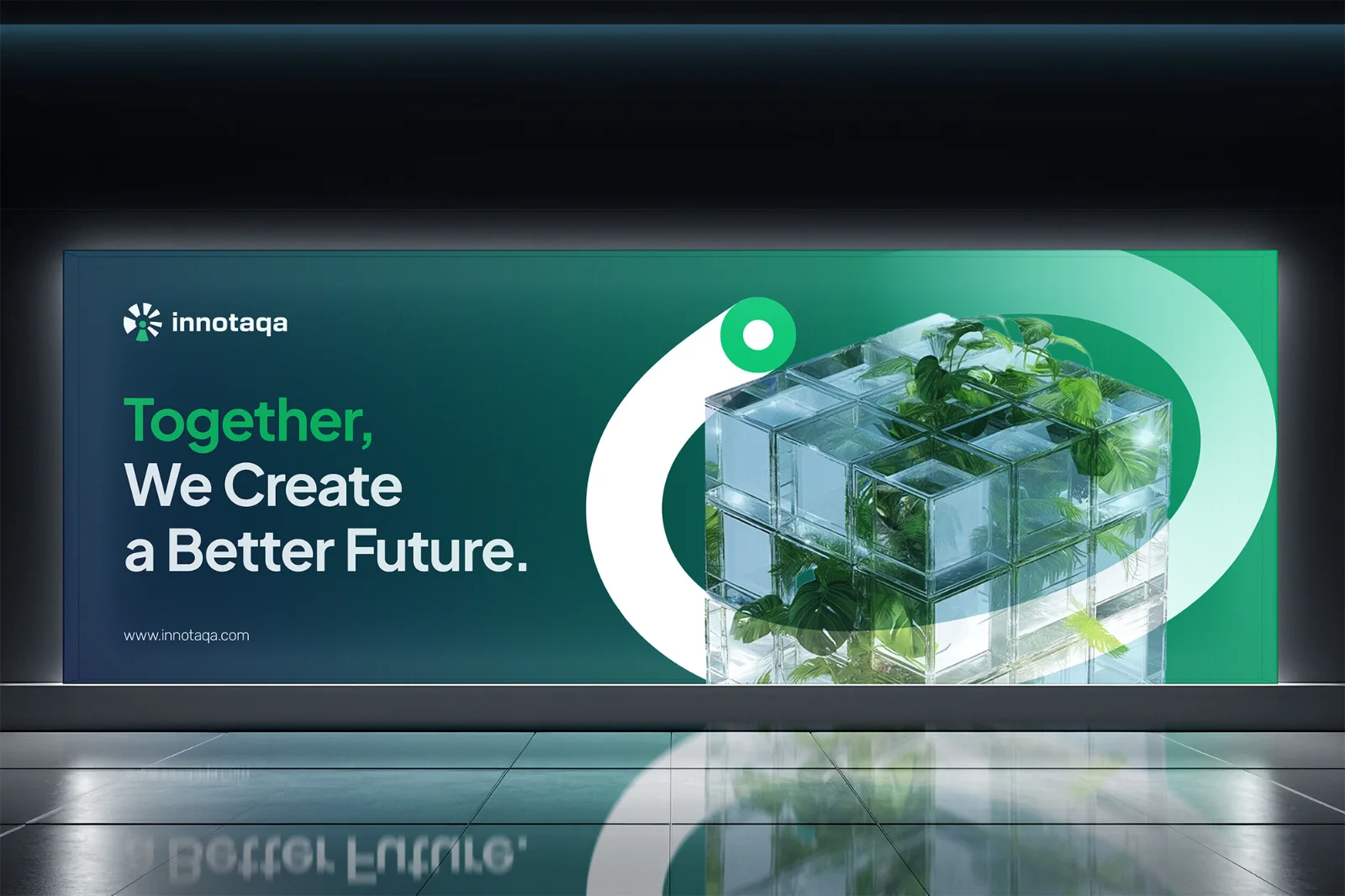
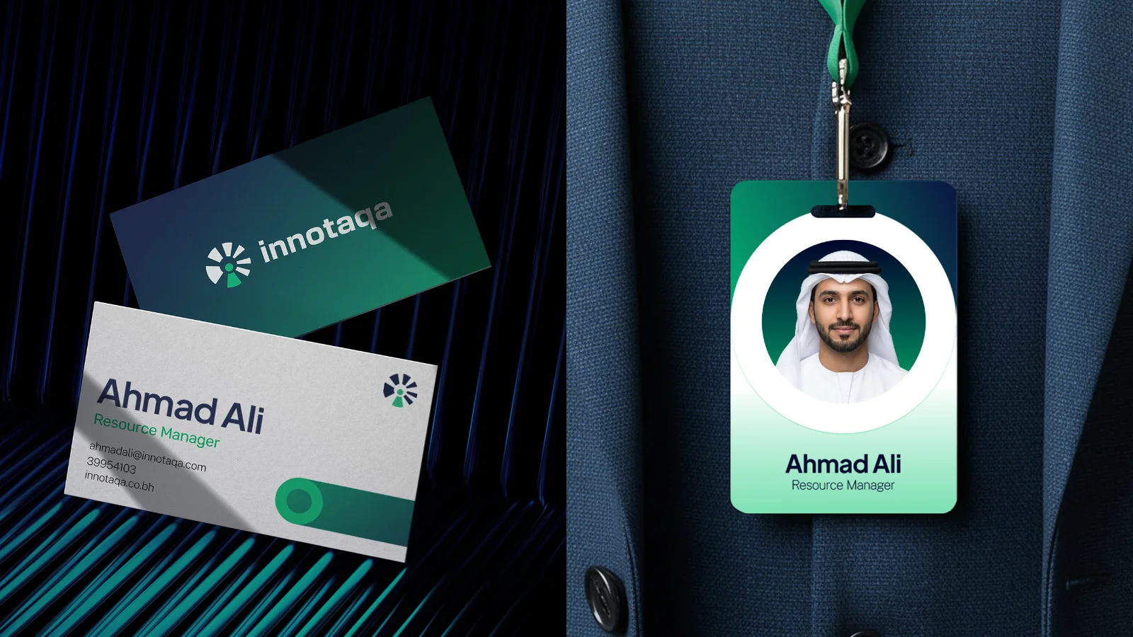
Designed to live across both digital and physical touchpoints, the identity draws on bold colors, radial forms, layered graphics, and image treatments to create an eye-catching presence. The result is a visual language full of life and motion, flexible enough to stay distinctive wherever the brand appears.
Powering the Next Chapter
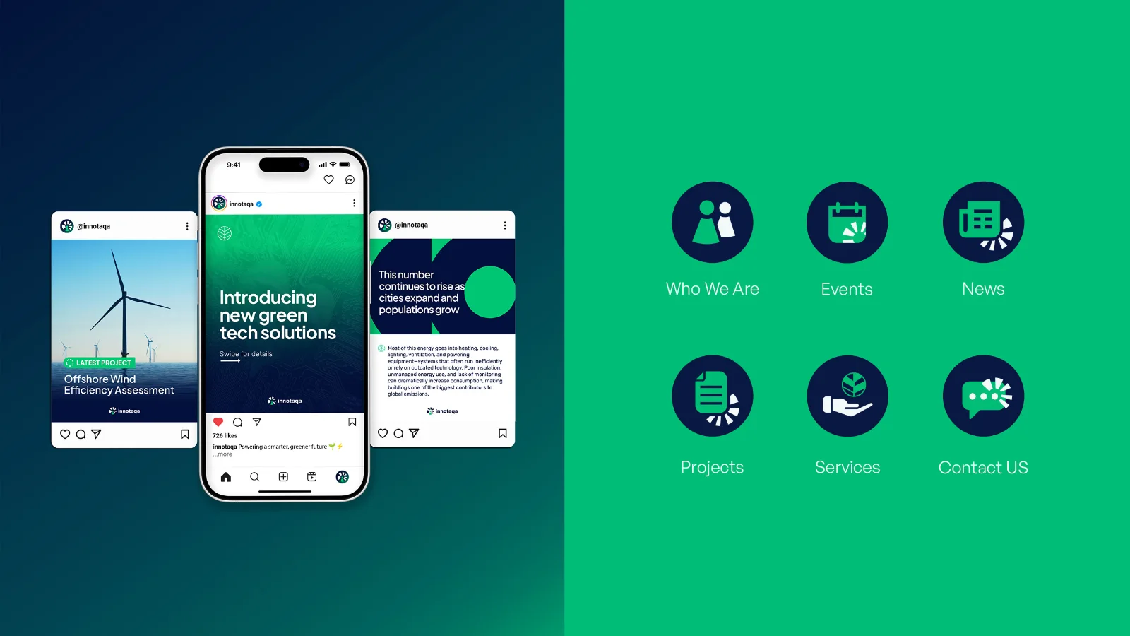
Innotaqa launched its new identity across social media, introducing the brand through a consistent and recognizable visual language. Supported by clear brand guidelines and a flexible design system, the new identity was adopted smoothly by the internal team.
The rebrand was met with an enthusiastic response from the founder and wider team, giving Innotaqa an identity that felt true to its vision and ready to support its next stage of growth.
More projects