Hello! We have been working on creating many beautiful brands, and building a guideline for each.
But… Have you ever noticed how some great brands go crazy with their guidelines? Apple being one ✨
Let’s check out the 80’s! ⏰ When life was pretty colorful!
Noticed something strange about this guideline? 🤔
I mean, aside from the fact that it’s a scanned version.
Yup, it has no cover and dives straight into “Don’ts”.
This way, the viewer will be intrigued. “No? No?… No… No…. Another no… What is it with this word?”… Pretty engaging 😏 wouldn’t you agree?
Another thing that’s worth mentioning is that you can’t ignore the fact that the way the guideline is designed, communicates Apple’s personality back then… You read through, and it sounds quirky and engaging, more approachable. It really invites you to keep scrolling (or flipping the pages back then) because you want to know more!
Not only the written bit, but also the language itself, the visuals, everything about it screamed Apple!
Ok this was fun… Let’s go to the 90’s 😌
As Apple’s fanbase grew bigger, the brand also grew with it. A new guideline was needed, some rules needed to be communicated more clearly.
Now think… What changed here? 🤔
- There’s a good introduction explaining why someone should follow the brand standards.
- Clear instructions in every section, detailing the importance of the rules stated.
- There are also a few additions to the logo section, you’ll notice that a minimum size was added for the logomark.
- Pantone values were added to the Apple’s colors.
- There are even rules to how the logo should be printed! (See page 9.)
- A full Logotype section is added too, showing examples of corporate name per country, as well as recommended clear space and minimum size.
- A comprehensive typography section that suggests the tracking for each point size, for both Body copies and headlines.
- Mockups and brand applications were removed.
Moving away from the colorful era → on to minimalistic times ⌚
The 2013 and 2016 versions look more technical, tailored more specifically to apple certified resellers, and marketing channels (social media, online and offline advertising.. etc).
This is when we notice, the names of these documents changed to guidelines rather than “brand standards”. Additionally, these brand guidelines have more writing and less visuals compared to the previous ones in the past. Language changed from quirky to more formal and more direct, emphasizing on the professional direction Apple is internationally headed to.
👉 In the end, we learn that…
The guidelines should communicate the brand’s tone when it speaks.
If a brand was a person, how would they sound like? formal / professional? funny / full of puns? friendly / approachable?
Always give it a thought when you design this piece of document, as Apple said:
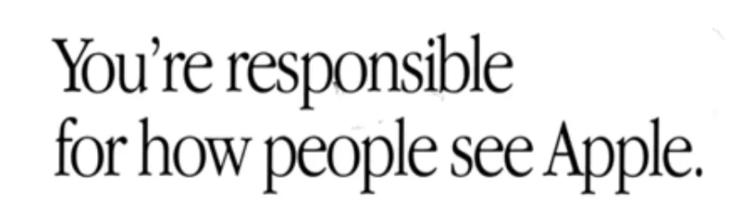
And that goes for any brand. 😎