
.svg)
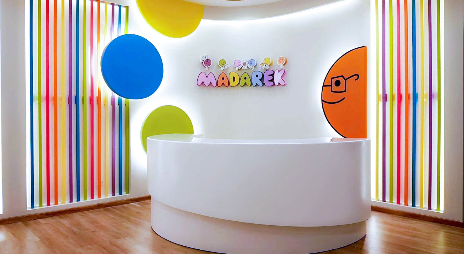
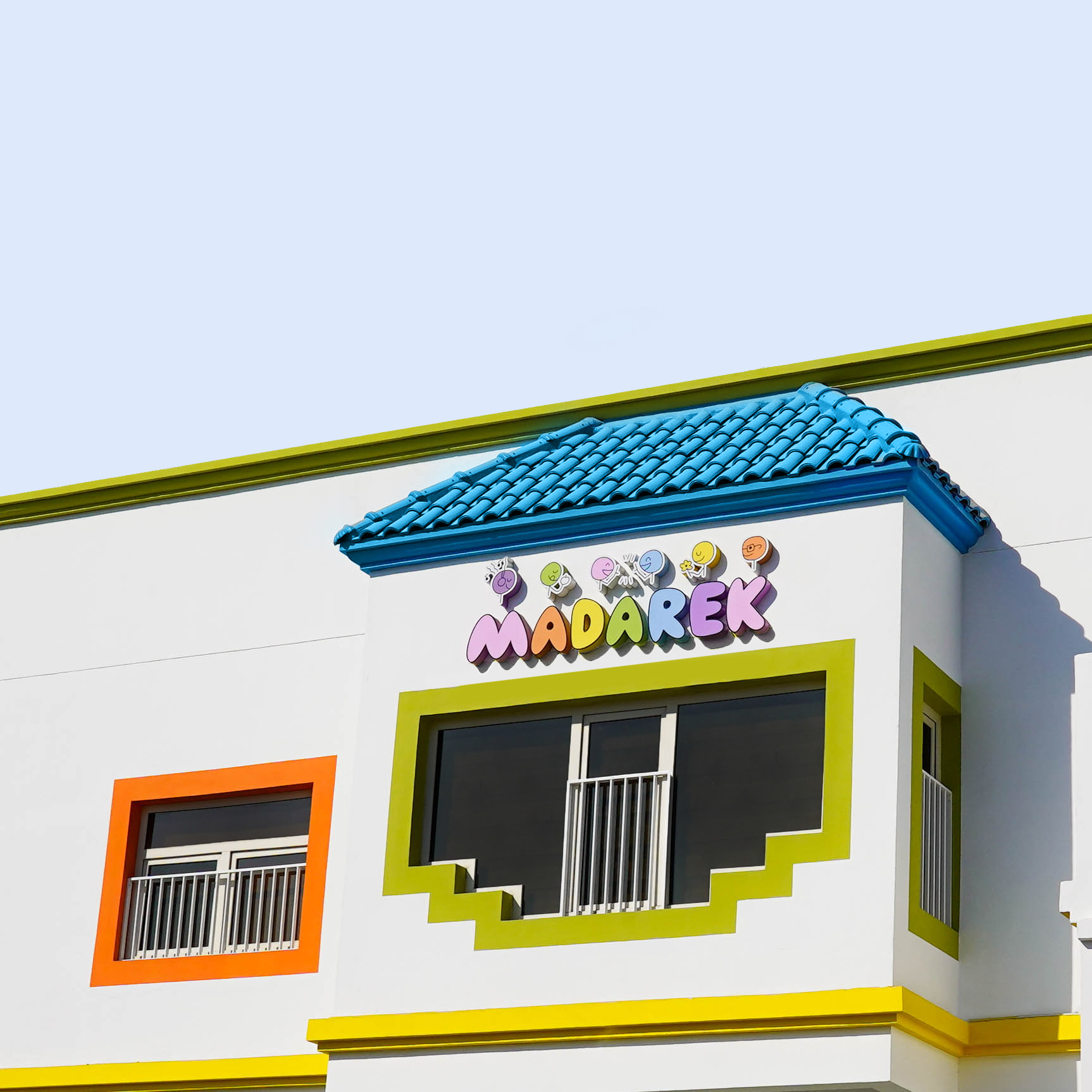
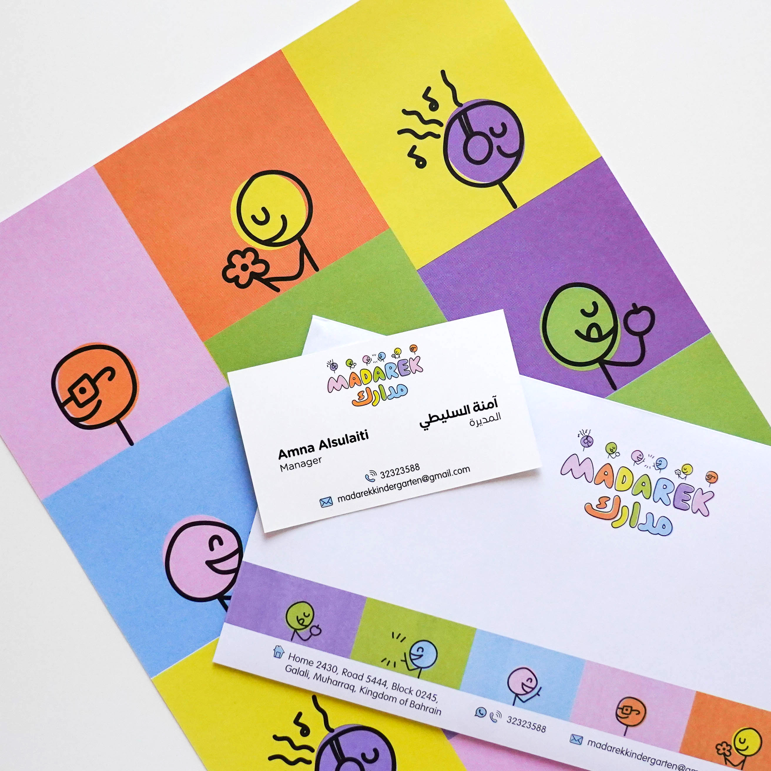
Madarek’s brand identity was developed by Limefish Design to reflect a warm, playful, and modern learning environment for young children. The project focused on creating a friendly and approachable visual identity that captures the spirit of activity-based education through a colourful, youthful, and engaging brand system. The scope included the logo, brand identity, brand guidelines, and stationery applications.
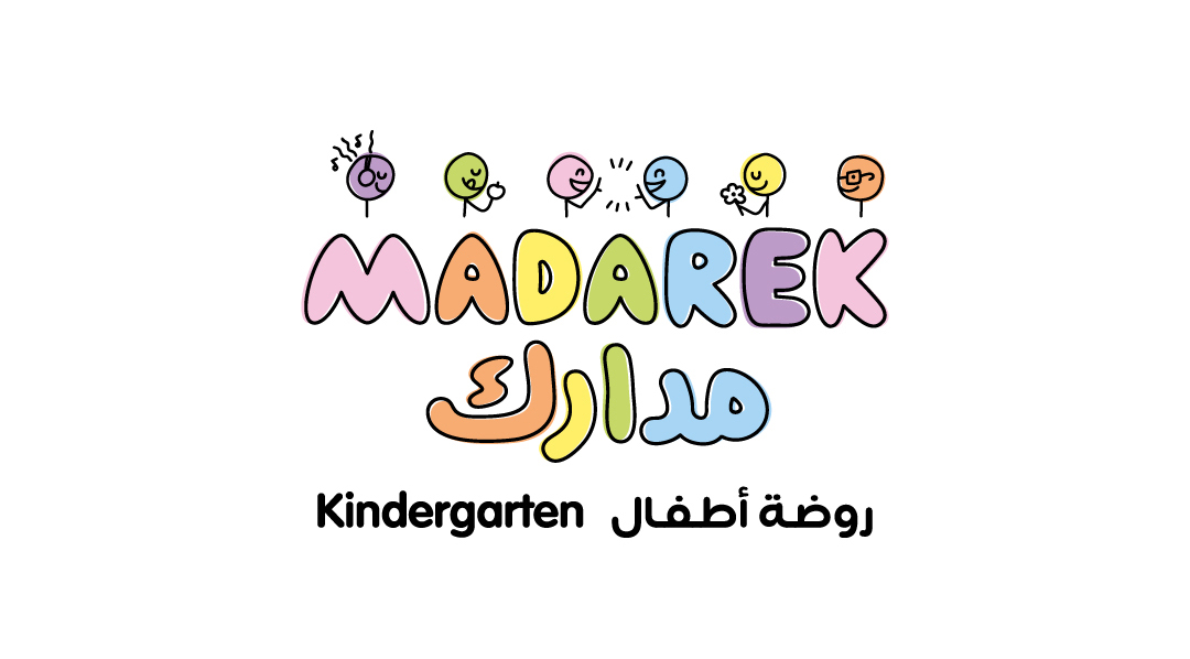
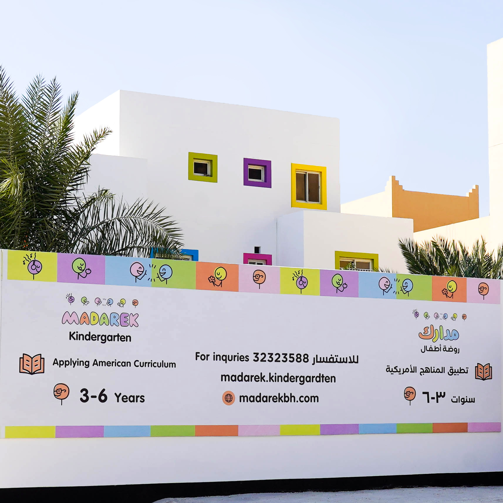
Madarek, in Arabic meaning senses, is a kindergarten based in Bahrain that applies American curriculum and adapts sensory-based teaching to its students. The kindergarten manager approached us for a complete branding and logo design, a project that we were happy to take on. Our scope essentially included creating a brand identity with distinct brand elements and stationery design.
Madarek’s logo has no dominant color, it has 6 colors! It was challenging to use this amount of colors without it appearing too heavy on the eyes, so we chose soft colours to avoid visual noise. We went with all 6 soft colors and tried to balance them equally while maintaining a natural flow. After many variations and attempts using color charts from Pantone Matching System (PMS), we were able to sharply design the final product - all while using colors that are a perfect fit for the brand! We used the colors that match the interior of the classrooms and hallways, giving the parents and young students a glimpse into the aesthetic of the kindergarten.
One of the most important aspects of developing a brand identity is its tone of voice. We sat down with Madarek and had a card exercise session about the main keywords that would be ideal for the brand. These keywords act as guidelines for the design process, brand elements and visual aspects of the brand - it affects how the brand communicates to the world and what type of emotions it wants to evoke. As it is a kindergarten, we wanted to keep in mind who the brand will be targeting and how the visual identity will contribute to the goals of the business.
Here are the keywords:
We had fun with this one because there were no rules to follow! We went with what kids would like to see and it was a fun process playing with the colors to achieve the final result. There were no limits to creativity, we went as playful as possible. After all, the designs are meant for children ages 3-6! What made us most proud is the ability to develop a colorful brand that gives kids a fun and playful environment and a welcoming setting. Our designs and branding also helped the kindergarten stand out from competitors, showcasing a real effort into visual design and cohesion.
We greatly enjoyed working with the founder of Madarek because of the collaborative nature of the design process. The process relied a lot on our client's point of view and input, which has guided us in exploring the project as a whole. We like when clients give us their feedback because they are experts in their field and can give us helpful context when we develop designs. They also give us their sense of direction for the visuals because it’s their brand and we want to deliver their vision! Madarek is a perfect case study that we use for other clients because of the smooth design process, collaboration and high-quality, original results that communicate the right message!
Hit Enter to Search or X to close