
.svg)
Maydan is an experiential training company built on the belief that growth happens through challenge. As the company evolved and expanded its offerings, the team recognized the need for a brand that better reflects the scale of their work and the depth of their impact.
Our scope included a full rebrand and repositioning, covering the development of a new identity, sub-brands, brand collaterals, and logo animation.
Maydan’s philosophy is rooted in challenge-based learning, where individuals collaborate to achieve outcomes they may not have thought possible. Their programs serve a wide range of clients across Bahrain and the GCC, including government entities, international companies, and small businesses.
As the company grew, they recognized the need for a brand that better reflects the scale of their work and the strength of their offering. With the transition from Campinya to Maydan, this became an opportunity to evolve their identity while remaining familiar to their existing audience.
The challenge was to reposition Maydan with a stronger and more credible identity, while preserving the spirit of the original brand. The new identity also needed to communicate discipline, collaboration, and the idea that meaningful achievements come from working toward a shared goal.


Our strategy focused on capturing the essence of Maydan’s learning philosophy while strengthening the trust and credibility expected by its audience. The brand needed to reflect the journey individuals experience through Maydan’s programs, moving from challenge and uncertainty toward achievement and growth.
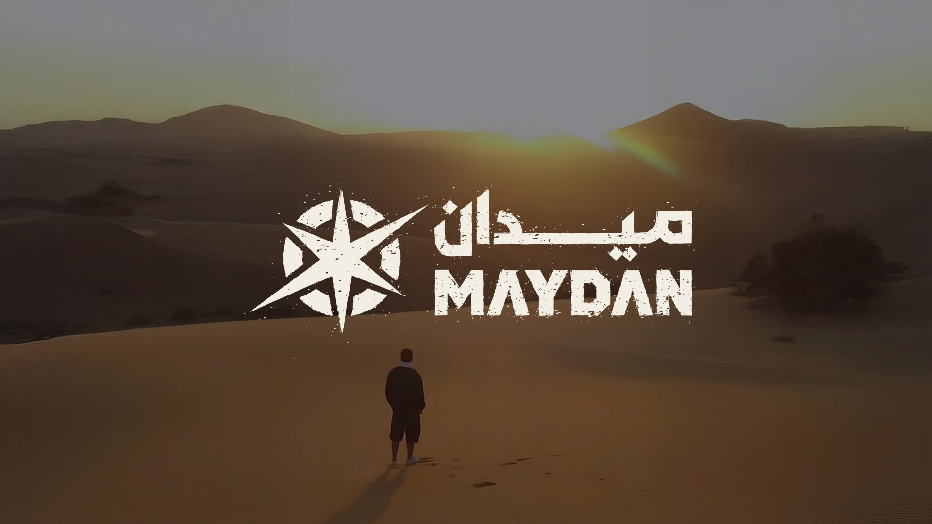
The repositioning centered on Maydan as a space for transformation, where individuals and teams step into an environment that pushes their limits and builds resilience.
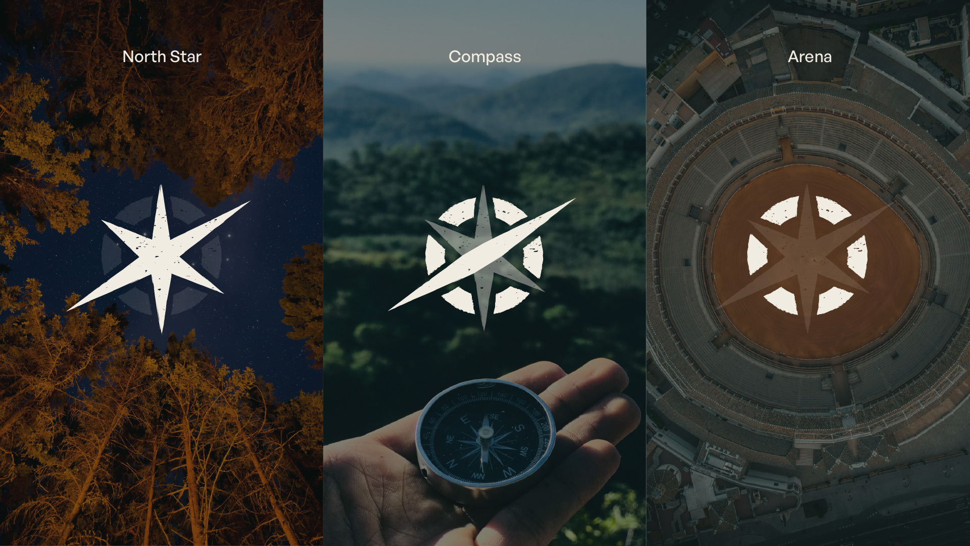
The identity draws inspiration from the symbolic meaning of the arena, a place where individuals face challenges together. The visual concept brings together elements that reflect both exploration and structured guidance.
The mark integrates multiple symbolic components:
Together, these elements reflect resilience, tactical thinking, and active engagement, positioning the experience as a catalyst for personal and collective growth.
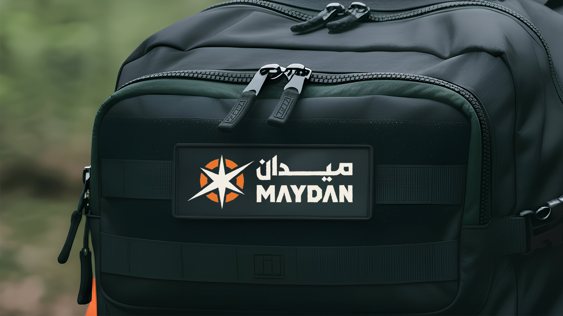
The identity system balances structure with authenticity. The logomark incorporates subtle texture to reflect the physical nature of experiential learning environments.
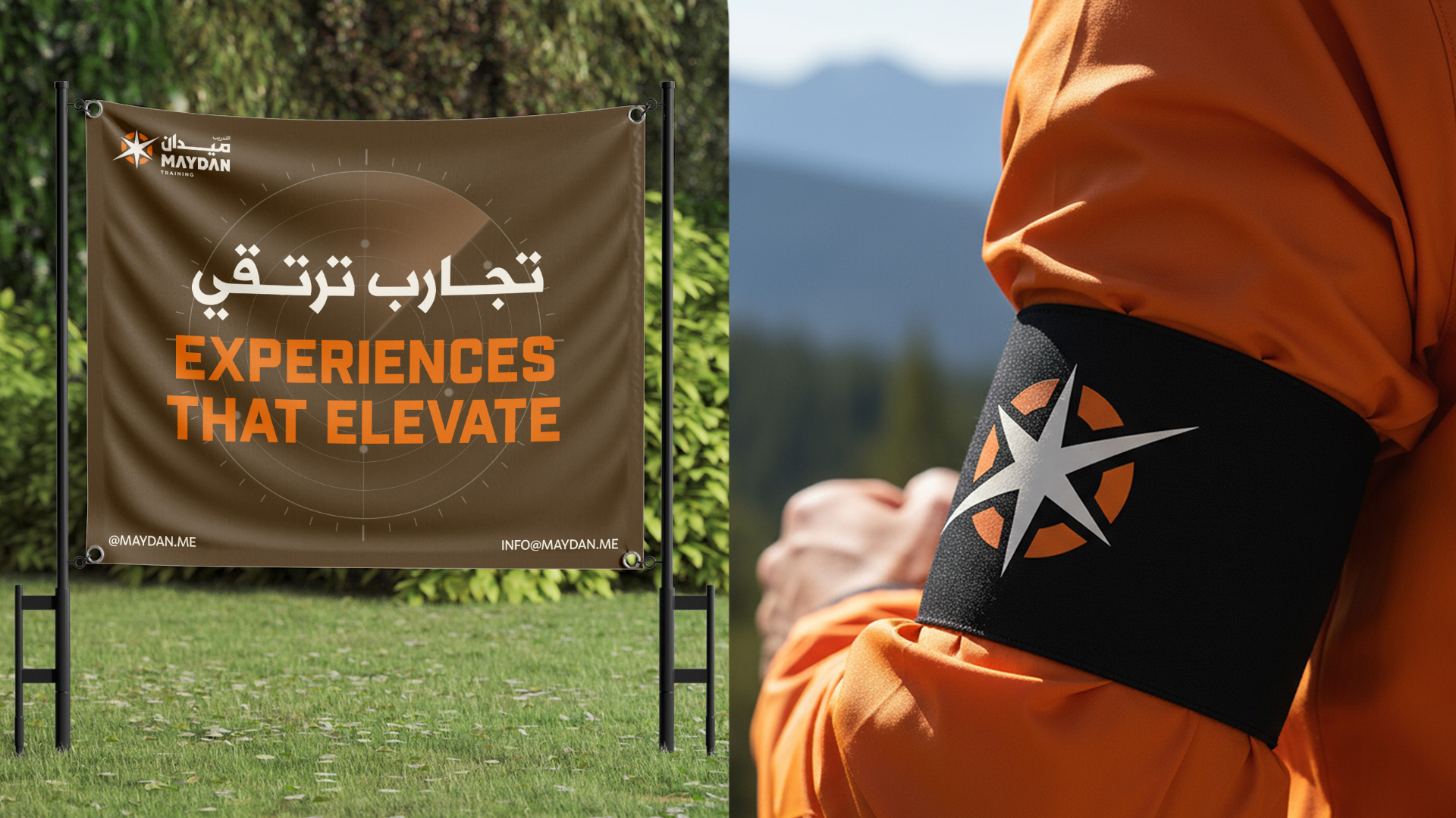
A clear color system was developed to differentiate between Maydan’s offerings. Orange represents training, capturing energy and group dynamics, while green represents adventure, reflecting exploration and personal growth. Supporting typography and brand elements were designed to ensure consistency across all touchpoints while allowing flexibility in application.

The project delivered a complete brand transformation including:

The new identity was introduced through a smooth rollout centered around Maydan’s promise of delivering experiences that elevate. The transition successfully maintained continuity with the company’s existing reputation while presenting a stronger, more confident identity.

The rebrand marked a turning point for the organization. The refreshed identity helped reposition Maydan from a growing startup to a more established and trusted provider of experiential training and adventure programs.
The client expressed strong appreciation for the transformation, describing Limefish as partners in bringing their vision to life. The new identity now reflects the ambition and scale of the experiences Maydan delivers.
Hit Enter to Search or X to close